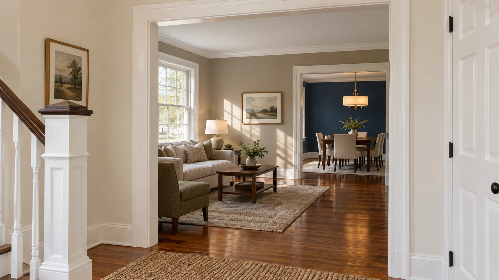
The most popular interior paint colors in 2026 are warm whites and off-whites on walls, warm greiges and soft taupes where people want more colour than white, muted sage and gray-greens in bedrooms and offices, and deep navy, charcoal or espresso brown on dining rooms, powder rooms, built-ins and interior doors. The 2026 direction from the paint companies is unmistakably warmer: Sherwin-Williams picked the khaki neutral Universal Khaki SW 6150 as its 2026 Color of the Year, Benjamin Moore picked the deep brown Silhouette AF-655, Behr picked the smoky jade Hidden Gem N430-6A, Valspar picked the green Warm Eucalyptus 8004-28F and Glidden picked the red-brown Warm Mahogany PPG1060-7. Cool gray is the colour quietly leaving, and the 2027 picks confirm it: Benjamin Moore's Webster Green HC-130, Sherwin-Williams' Celery SW 6421 and Behr's olive Grounded are all greens, and Valspar and Glidden chose soft blues.
We are a family-owned painting company in Morganville and have painted interiors across Monmouth, Middlesex, Ocean, Mercer, Somerset and Burlington counties, plus Union, Essex, Hudson, Bergen and Passaic in North Jersey, for more than 20 years, using Benjamin Moore and Sherwin-Williams products. Every estimate includes an in-home colour consultation, so a large part of our week is spent holding sample boards against somebody's oak floor at four in the afternoon. This guide is the named-colour list: the specific colours homeowners actually choose, with the manufacturer's own code and light reflectance value (LRV) for each, brand by brand and room by room. Every code, LRV and Color of the Year below was read off benjaminmoore.com, sherwin-williams.com, behr.com's corporate newsroom, valspar.com or glidden.com on 10 October 2026, and the 2027 picks were checked on 20 October 2026.
The Short Answer: The Most Popular Interior Paint Colors Right Now
- Warm whites and off-whites are the single most-painted interior colour: Benjamin Moore White Dove OC-17, Chantilly Lace OC-65, Simply White OC-117 and Swiss Coffee OC-45; Sherwin-Williams Alabaster SW 7008, Pure White SW 7005 and Shoji White SW 7042.
- Greige and warm neutrals carry the rooms that need to be more than white: Revere Pewter HC-172, Edgecomb Gray HC-173, Pale Oak OC-20, Agreeable Gray SW 7029, Accessible Beige SW 7036 and Natural Linen SW 9109.
- Soft greens are the colour family growing fastest indoors: October Mist 1495, Beach Glass 1564, Sea Salt SW 6204 and Evergreen Fog SW 9130.
- Blues split into pale and deep: Palladian Blue HC-144 for bathrooms and bedrooms, Van Deusen Blue HC-156 for built-ins, Hale Navy HC-154 and Naval SW 6244 for dining rooms and doors.
- Moody darks own the small rooms: Tricorn Black SW 6258, Iron Ore SW 7069, Urbane Bronze SW 7048, Chelsea Gray HC-168 and Silhouette AF-655.
- The five brands' 2026 picks are all warm or earthy. Not one of them is a cool gray, and that is the story of the year.
- Trim and ceilings do not follow the trend. A clean white on trim and a flat white on ceilings is still right in almost every New Jersey house we paint.
Interior Paint Colors for 2026: What the Paint Companies Picked
Every major brand names a Color of the Year for the coming year, and unlike the exterior picks, these are chosen with interiors firmly in mind. They are useful as a reading of where colour is heading, not as instructions. Here is what each one actually is.
Sherwin-Williams 2026: Universal Khaki SW 6150
Sherwin-Williams' 2026 Color of the Year page calls Universal Khaki "an essential neutral selected by our color experts for its beautiful balance of livability and longevity," and adds that "this mid-tone neutral with a slight yellow undertone embodies the satisfying simplicity at the core of contemporary comfort." The brand's theme for the year is "Tailored & Timeless." Its colour detail page gives an LRV of 40.478, which makes it a genuine midtone, not a pale neutral. On a wall it reads as a soft tan-stone. It is the most useful of the 2026 picks for a whole room, and it is the single clearest signal that the decade of cool gray walls is over.
Benjamin Moore 2026: Silhouette AF-655
Benjamin Moore's Color of the Year 2026 page describes Silhouette as "a distinctive color that weaves luxurious burnt umber with delicate notes of charcoal," and shows it in entryways, living areas, built-in cabinets, kitchens, bedrooms, bathrooms, dining rooms and offices, in Aura Interior and Regal Select Interior. Its colour page gives an LRV of 10.18 and calls it "reminiscent of tailored suiting," weaving "rich espresso hues with refined notes of charcoal." At that depth it is a one-room colour, not a whole-house colour. The rooms we would put it in are a dining room used at night, a powder room, a library wall with built-ins, or the inside faces of a run of interior doors.
The wider Color Trends 2026 palette is Raindance 1572, First Crush CSP-310, Swiss Coffee OC-45, Batik AF-610, Narragansett Green HC-157, Southwest Pottery 048, Sherwood Tan 1054 and Silhouette AF-655 — pales and warm midtones, with one blackened green.
Behr, Valspar and Glidden 2026
Three more picks matter because of where they are sold. Behr's newsroom announcement names Hidden Gem N430-6A, "a smoky jade that uncovers exceptional beauty in every space," with a palette of "grounding earth tones, deep jewel tones, and relaxed pastels." Valspar's press release names Warm Eucalyptus 8004-28F, "a grounded green that brings a sense of ease and timeless appeal to any space," supported by Degas Blue 8004-35B and Groundbreaking 8005-8F, and states that it is "available exclusively at Lowe's stores, on Lowes.com and the Lowe's mobile app," with "a comparable color, Sage Slate V143-5," at independent retailers. Glidden's 2026 page names Warm Mahogany PPG1060-7, "a rich, grounded red that's bold enough to draw immediate attention and reserved enough to make a timeless statement."
The 2027 Colors of the Year
All five brands have now named their 2027 colours, and the story is green and blue. Sherwin-Williams chose Celery SW 6421, which its 2027 page calls "an airy, herbal green that embodies fresh perspectives and elegance," with an LRV of 71.303 — a pale, usable wall colour rather than an accent. Benjamin Moore announced Webster Green HC-130 on 14 October 2026; its press release calls it "a confident hue with undeniable personality" that "transcends styles and timeframes with ease," and its colour page gives an LRV of 20.2, so it is a deep green for cabinetry, a study or a dining room rather than a whole house. It comes from the Historical Collection, which suits the older houses in our area well. The rest of Benjamin Moore's Color Trends 2027 palette is White Down OC-131, Nelson Blue CW-635, Shakespeare Tan 228, Antique Copper 1169, Wild Aster 1240, Durango 2137-30 and Townsend Harbor Brown HC-64.
Behr's 2027 announcement names Grounded T27-01, "an earthy olive green" that "moves effortlessly between olive and moss, anchored by subtle brown undertones," again sold only at The Home Depot. Valspar's 2027 page names Cottage Door, "a grayed-out blue hue, enriched with warm and inviting undertones," coded 8004-38E at Lowe's and V138-4 at independent Valspar retailers, paired with Apricot Blush and Moon Shot. Glidden's 2027 page names Artifact PPG10-16, "a calm, fresh aqua." If you are painting in spring 2027, a muted green or a grayed blue is the colour worth sampling early.
| Brand | 2026 Color of the Year | Code | What it is |
|---|---|---|---|
| Sherwin-Williams | Universal Khaki | SW 6150 | Warm midtone khaki neutral, LRV 40 |
| Benjamin Moore | Silhouette | AF-655 | Deep espresso brown with charcoal, LRV 10 |
| Behr | Hidden Gem | N430-6A | Smoky jade blue-green |
| Valspar (Lowe's) | Warm Eucalyptus | 8004-28F | Grounded warm green |
| Glidden | Warm Mahogany | PPG1060-7 | Rich grounded red-brown |
Read the table as a group and the trend is obvious: two warm neutrals, two greens and a red-brown. Nothing cool, nothing gray. That is the single most useful thing a homeowner can take from the 2026 announcements.
| Brand | 2027 Color of the Year | Code | What it is |
|---|---|---|---|
| Sherwin-Williams | Celery | SW 6421 | Airy herbal green, LRV 71 |
| Benjamin Moore | Webster Green | HC-130 | Deep classic green, LRV 20 |
| Behr | Grounded | T27-01 | Earthy olive with brown undertones |
| Valspar | Cottage Door | 8004-38E (Lowe's) | Grayed blue with warm undertones |
| Glidden | Artifact | PPG10-16 | Calm, fresh aqua |
Three greens and two blues for 2027, following 2026's warm neutrals. The direction has moved from warm toward green, not back toward cool gray.
The Most Popular Interior Paint Colors, Brand by Brand
Popularity is not something anyone can measure across a whole state, so this section combines what each manufacturer publishes about its own best sellers with what homeowners choose at our estimates. We work in Benjamin Moore and Sherwin-Williams every day; the other three sections are here because plenty of people shop at a big box store first, and because both of our brands can match a colour from any of them.
Benjamin Moore interior paint colors
Benjamin Moore's own interior paint colors page names its most popular interior colours as "Revere Pewter HC-172," "Simply White OC-117," "White Dove OC-17" and "Chantilly Lace OC-65," and for homeowners who want something more saturated it points to "October Mist 1495," "Beach Glass 1564" and "Proposal AF-260." For small spaces it suggests the lighter "Cloud White OC-130" and "November Rain OC-50," or the darker "Chelsea Gray HC-168" for a cosier feel. That list matches our job sheets almost exactly: White Dove and Revere Pewter are the two colours we buy most.
Sherwin-Williams paint colors interior
Sherwin-Williams keeps a Top 50 interior colours collection — "our 50 most popular paint colors. Among these loved and trusted hues, you'll find favored grays, whites, neutrals and even some unexpected colors." Sue Wadden, the brand's director of colour marketing, says there that "these colors are consistent customer favorites for a reason. If you're looking for a hue to stand the test of time, pick from the top 50." The colours shown first are Tricorn Black SW 6258, Drift of Mist SW 9166, Shoji White SW 7042, Pure White SW 7005, On the Rocks SW 7671, Accessible Beige SW 7036, Sea Salt SW 6204, Alabaster SW 7008, Natural Linen SW 9109 and Agreeable Gray SW 7029. That is, in effect, the top 10 most popular interior paint colors from one of the two biggest brands in the country, published by the brand itself.
Behr interior paint colors
Behr is sold through one retailer: its 2026 announcement states that Hidden Gem is "available in BEHR DYNASTY®, BEHR® MARQUEE®, BEHR ULTRA® and BEHR PREMIUM PLUS®, exclusively at The Home Depot stores nationwide and online." Behr's own description of the colour is that it "nurtures calm with its blue-green undertones and encourages self-expression with its vibrancy." If you have already fallen for a Behr colour from a chip, bring the chip to your estimate — we can have it matched in a Benjamin Moore or Sherwin-Williams product rather than switching paint lines.
Valspar interior paint colors and Lowe's paint colors interior
Valspar is the Lowe's house brand, and its press release is explicit that Warm Eucalyptus 8004-28F is sold "exclusively at Lowe's stores, on Lowes.com and the Lowe's mobile app," with Sage Slate V143-5 as the comparable colour at independent retailers. The release lists Valspar Ultra, Valspar Reserve and Valspar Signature as its interior lines. Its two supporting colours are worth knowing because they are both on-trend for 2026 in their own right: Degas Blue 8004-35B, "a breezy light blue warmed by hints of green and gray," and Groundbreaking 8005-8F, "a cozy deep brown with gray undertones."
Glidden paint colors interior
Glidden, a PPG brand, has gone the other way for 2026 with Warm Mahogany PPG1060-7, the only red in the group. Its page presents it as part of a 16-colour trends palette. A red-brown of that depth is a dining room, a study or a stair hall, and in our experience it needs warm wood and warm metals in the room to look deliberate rather than dated.
Top 10 Most Popular Interior Paint Colors at a Glance
| Colour | Brand and code | LRV | Where we use it indoors |
|---|---|---|---|
| Chantilly Lace | Benjamin Moore OC-65 | 90 | Trim, ceilings, gallery-white walls |
| Simply White | Benjamin Moore OC-117 | 90 | Kitchens, trim, cabinets |
| Pure White | Sherwin-Williams SW 7005 | 84 | Trim and cabinet white |
| White Dove | Benjamin Moore OC-17 | 83 | Walls and trim throughout a house |
| Alabaster | Sherwin-Williams SW 7008 | 82 | Warm white walls, cabinets |
| Shoji White | Sherwin-Williams SW 7042 | 74 | Warm off-white walls with oak floors |
| Classic Gray | Benjamin Moore OC-23 | 74 | Light, barely-there walls in bright rooms |
| Celery (2027 SW COTY) | Sherwin-Williams SW 6421 | 71 | Pale green walls, bedrooms, sunrooms |
| Drift of Mist | Sherwin-Williams SW 9166 | 69 | Light neutral walls, open plans |
| Pale Oak | Benjamin Moore OC-20 | 69 | Warm light neutral; good with red brick |
| Natural Linen | Sherwin-Williams SW 9109 | 66 | Soft warm walls in north-facing rooms |
| Edgecomb Gray | Benjamin Moore HC-173 | 63 | Light greige walls, whole-house palettes |
| Sea Salt | Sherwin-Williams SW 6204 | 63 | Bathrooms, bedrooms, laundry rooms |
| On the Rocks | Sherwin-Williams SW 7671 | 62 | Soft warm greige walls |
| Collingwood | Benjamin Moore OC-28 | 62 | Warm gray walls near red brick |
| Palladian Blue | Benjamin Moore HC-144 | 60 | Bathrooms, bedrooms, shore houses |
| Agreeable Gray | Sherwin-Williams SW 7029 | 60 | The default greige for open plans |
| Repose Gray | Sherwin-Williams SW 7015 | 58 | Cooler light gray in sunny rooms |
| Accessible Beige | Sherwin-Williams SW 7036 | 58 | Greige walls with oak floors |
| Revere Pewter | Benjamin Moore HC-172 | 55 | Bridging warm floors and cool furniture |
| Beach Glass | Benjamin Moore 1564 | 50 | Bathrooms, bedrooms, beach houses |
| October Mist | Benjamin Moore 1495 | 47 | Sage walls in bedrooms and offices |
| Universal Khaki (2026 SW COTY) | Sherwin-Williams SW 6150 | 40 | Warm midtone walls, color-drenched rooms |
| Evergreen Fog | Sherwin-Williams SW 9130 | 30 | Cabinets, built-ins, moody bedrooms |
| Chelsea Gray | Benjamin Moore HC-168 | 23 | Islands, built-ins, small cosy rooms |
| Van Deusen Blue | Benjamin Moore HC-156 | 12 | Built-ins, cabinetry, studies |
| Silhouette (2026 BM COTY) | Benjamin Moore AF-655 | 10 | Dining rooms, powder rooms, doors |
| Hale Navy | Benjamin Moore HC-154 | 8 | Dining rooms, offices, interior doors |
| Urbane Bronze | Sherwin-Williams SW 7048 | 8 | Bronze-brown trim, doors, accent walls |
| Iron Ore | Sherwin-Williams SW 7069 | 6 | Softened black on doors and millwork |
| Naval | Sherwin-Williams SW 6244 | 4 | Islands, powder rooms, interior doors |
| Tricorn Black | Sherwin-Williams SW 6258 | 3 | Interior doors, sashes, railings |
The "where we use it indoors" column is our own recommendation, not the manufacturer's. Everything else in the table came off the brand's own colour page.
Interior Wall Paint Colors: Whites and Off-Whites
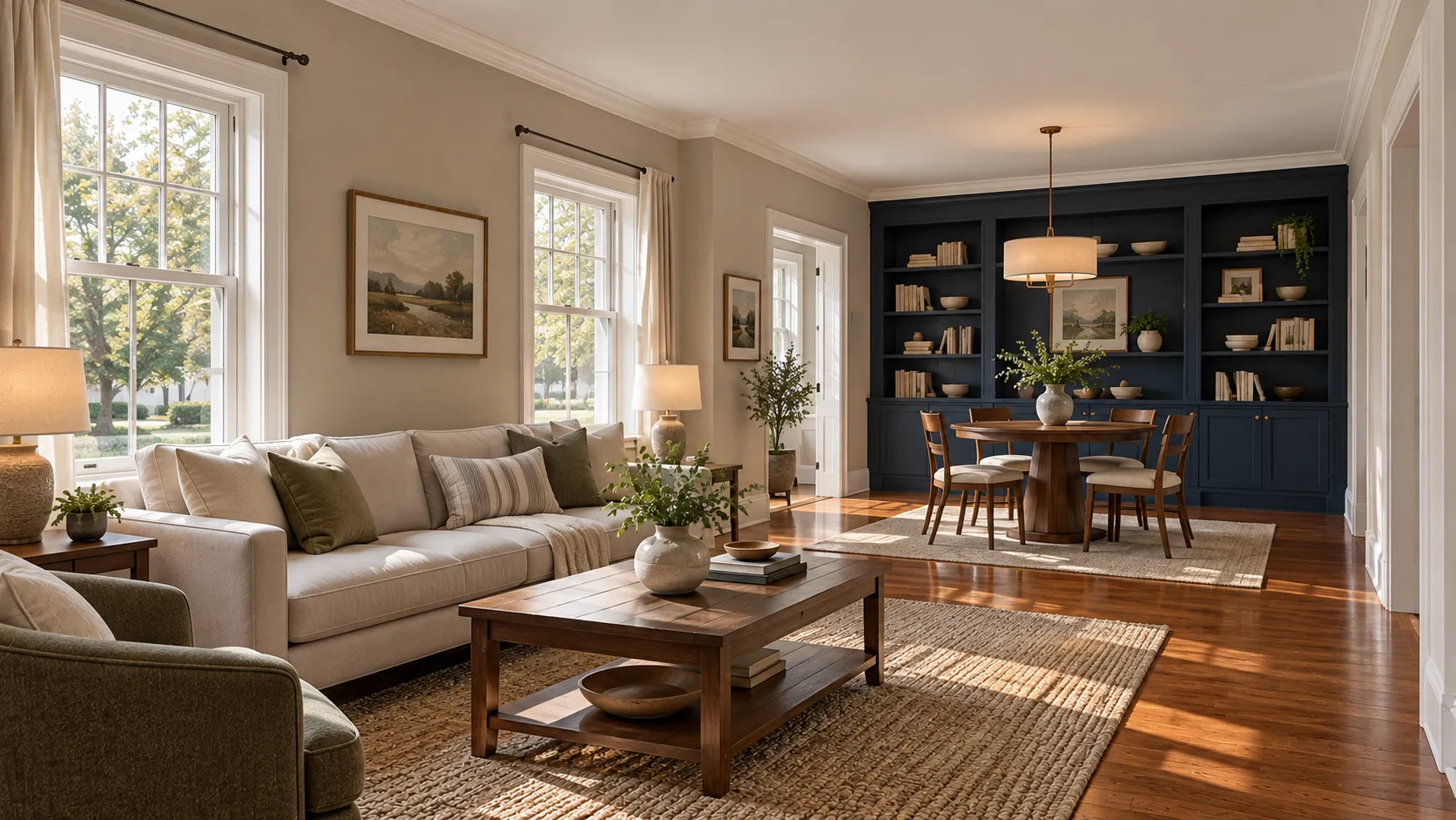
White is still the most-painted interior wall colour, and the real decision is how warm it is. Benjamin Moore calls Chantilly Lace OC-65 "a classic go-to white that elicits images of fresh cotton and pure silk" at LRV 90.04, and Simply White OC-117 a white where "the slightest hint of warmth makes this clean, crisp white a favorite to use anywhere in the home" at 89.52. White Dove OC-17, at 83.16, is the softer one — "unerring style defines this clean and classic white" — and it is the colour we recommend more than any other for a whole house, because it takes trim, walls and cabinets without looking different in each room. On the Sherwin-Williams side, Pure White SW 7005 sits at 83.957, Alabaster SW 7008 at 82.215, and Shoji White SW 7042 is a notably warmer off-white at 74.345.
Two things we tell people every week. First, a white in the high 80s or 90s goes cold and slightly blue in a north-facing room and glaring in a south-facing one at midday; a white in the low 80s behaves in both. Second, an off-white wall needs a brighter white on the trim beside it or the trim reads dirty. Chantilly Lace trim against White Dove walls is the pairing we specify most.
Greige, Beige and Warm Interior Paint Colors
Greige — the blend of gray and beige — is the family that survived the gray decade, because it works with the oak and red-oak floors in most New Jersey houses instead of fighting them. Benjamin Moore calls Revere Pewter HC-172 "an iconic neutral that provides a versatile bridge between warm and cool tones" (LRV 55.05) and Edgecomb Gray HC-173 "a go-to neutral that can refresh a space, while providing a warm, welcoming feeling" (63.09). Pale Oak OC-20, at 68.64, has "warm gray undertones" that "conjure the quiet majesty of white oak." On the Sherwin-Williams side Agreeable Gray SW 7029 (60.386) is the most-specified greige in the country, Accessible Beige SW 7036 (57.67) is the warmer one, and Natural Linen SW 9109 (66.329) is softer again.
The 2026 picks push this family one notch warmer still. Universal Khaki at LRV 40 is what happens when you keep going past greige into true tan, and it is the colour to sample if every greige you have tried has looked washed-out in a bright room.
Greys — and the Outdated Interior Paint Colors Nobody Asks For Now
Gray is still in the Sherwin-Williams top 50 and still on plenty of New Jersey walls, but the cool, blue-leaning grays that covered this state between about 2012 and 2021 are the clearest example of a colour that dates a room. Repose Gray SW 7015 (58.22) and On the Rocks SW 7671 (61.609) are the light grays that still look current because they carry warmth; Chelsea Gray HC-168, "a handsome gray with the slightest hint of brown" at 23.33, works because it is really a warm charcoal.
What we get asked to paint over, in rough order of frequency: cool blue-gray walls with stark white trim, gray walls over gray-washed flooring in the same cool family, builder beige from the 1990s with a yellow cast, sponged and ragged faux finishes, burgundy and hunter green dining rooms from the 1990s, and gray-and-white kitchens where everything in the room is the same temperature. None of these are wrong, and a well-kept gray room beats a badly painted trendy one. But if you are selling or refreshing and want one thing to change, warming the wall colour up by a few degrees is it. That is our observation from our own repaints, not a statistic — nobody publishes reliable numbers on which interior colours are dated.
Interior Green Paint Colors
Green is the fastest-growing interior colour family we see, and the brands agree: two of the five 2026 Colors of the Year are greens and the 2027 Sherwin-Williams pick is a third. The muted, grayed greens are the ones that work in a real house. Benjamin Moore lists October Mist 1495 — "evocative of the stem of a flower, this gently shaded sage anchors and uplifts," LRV 46.54 — among the colours it recommends when homeowners want more saturation than a neutral. Beach Glass 1564 (49.7) is the blue-green cousin: "a gray undertone brings versatility to this calming blue." Sherwin-Williams Sea Salt SW 6204 (63.233) is the pale green-blue that ends up in more New Jersey bathrooms than any other colour we mix, and Evergreen Fog SW 9130 (30.402) is the deep gray-green we use on islands, built-ins and bedroom walls.
For 2026 specifically, Behr Hidden Gem N430-6A and Valspar Warm Eucalyptus 8004-28F are both in this family, and Sherwin-Williams Celery SW 6421 (71.303) opens 2027 as a pale version of it. If you want a colour that will still read current in five years but is not a neutral, a muted green is the safest bet on the board.
Interior Blue Paint Colors
Blue indoors divides cleanly into two jobs. Pale blues and blue-greens are restful wall colours: Palladian Blue HC-144, "all is calm with this soft, airy blue-green that conjures clear skies," at LRV 60.4, is a classic in Jersey Shore bedrooms and bathrooms, and Valspar's Degas Blue 8004-35B is the 2026 version of the same idea. Deep blues are accent colours: Van Deusen Blue HC-156 (11.97) is "a foundational blue color that fits easily into both traditional and modern spaces" and is our usual choice for painted built-ins; Hale Navy HC-154 (8.36) is "a use-anywhere shade of navy with a classic maritime feel"; Naval SW 6244 (4.458) is the deeper, more saturated navy that suits an island or a powder room.
One caution from our own work: a mid-tone blue on all four walls of a north-facing room in a New Jersey winter is a cold room. Keep the pale blues for rooms that get sun, and put the deep blues where you want drama in a space you use at night.
Modern and Moody: Dark Interior Paint Colors
Dark rooms are the most-requested "modern" look right now, and they are also the easiest to get wrong. Sherwin-Williams' own guide to creating a dark living room is unusually candid about it: "for a truly dark and moody look, choose colors with a low LRV, as they absorb more light, contributing to that deep, rich and enclosed feeling within a room," but "while the goal is a dark and moody atmosphere, there's a fine line between cozy and cavernous." It names Tricorn Black SW 6258, Naval SW 6244, Evergreen Fog SW 9130, Grizzle Gray SW 7068 and Iron Ore SW 7069, says a dark ceiling "visually lowers the space, creating a sense of a warm, comforting enclosure," and advises avoiding "harsh overhead lighting" in favour of "soft, layered lighting."
That matches what we see. Dark colours work in small rooms used in the evening — powder rooms, dining rooms, studies, a den over a garage — and in rooms with a lot of natural light to spend. Colour-drenching, where the walls, trim and ceiling all carry the same colour, is the version of this that has taken over in 2026; Benjamin Moore shows Silhouette that way in its own Color Trends 2026 rooms. Practically, deep colours need more coats and often a tinted primer, and they are harder to touch up, so keep a labelled quart.
Trim, Ceiling and Interior Door Paint Colors
Wall colour gets all the attention and trim colour decides whether the room looks finished. Our defaults, on almost every New Jersey interior:
- Trim and millwork: a clean white — Chantilly Lace OC-65, Simply White OC-117 or Pure White SW 7005 — in satin or semi-gloss. One trim white for the whole house, not a different one per room.
- Ceilings: flat white, usually a ceiling-specific product. Benjamin Moore's finish guide lists flat for "Ceilings, Walls in Low Traffic Spaces" for exactly this reason: any sheen overhead shows every taped seam.
- Interior doors: the one place to take a risk cheaply. Sherwin-Williams' colour team puts it well in its door colour piece: "a hallway full of doors is the perfect place to get creative with color." Its picks there include Peppercorn SW 7674, Waterscape SW 6470, Sprout SW 6427, Quite Coral SW 6614 and White Truffle SW 6029.
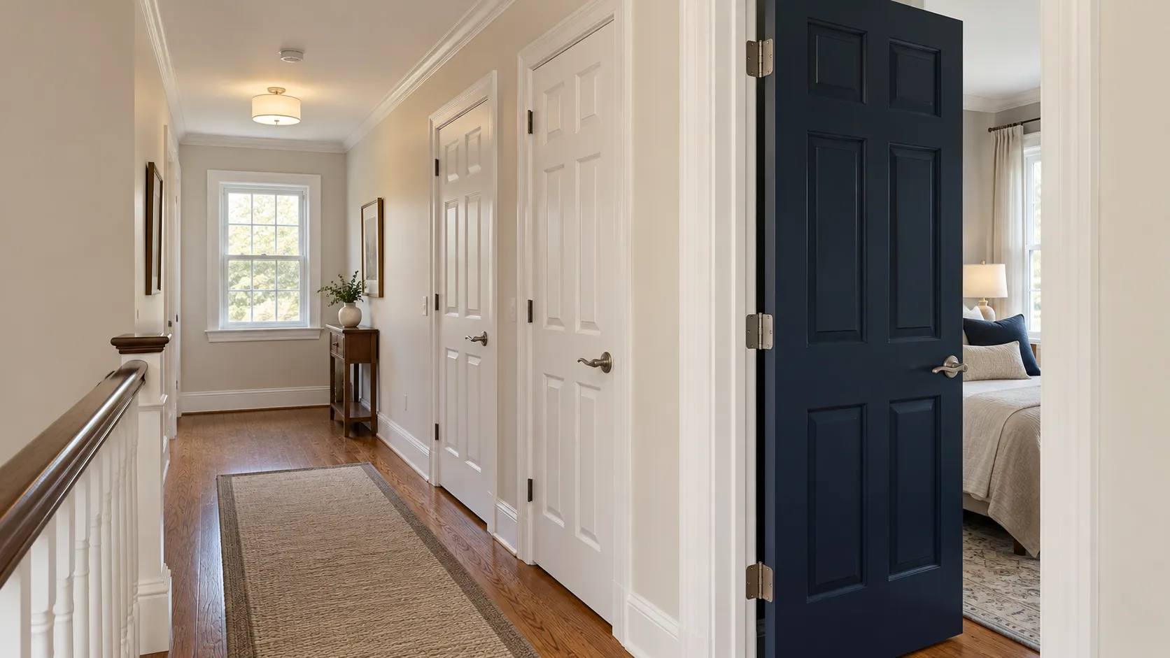
The interior door colours we are actually asked for are the deep ones: Tricorn Black SW 6258, Iron Ore SW 7069 for a softer black, Hale Navy HC-154, Urbane Bronze SW 7048 and, for 2026, Silhouette AF-655. A common and inexpensive version is to paint only the inside face of each door a colour and leave the casing and the hall side white. Doors and trim take a harder finish than walls; our paint sheen guide covers which, and we will not repeat it here.
Interior Paint Colors by Room
Sherwin-Williams' living room colour page gives the pattern we also follow: "for that cozy and inviting feel, consider a deep brown neutral like Anonymous or a warm green-gray like Sweater Weather," "brighten a dimly lit space with a bright, warm white like Dover White," and for a calmer room "a deep, gray-toned navy like Charcoal Blue." Its named living room picks are Silver Strand SW 7057, Pure White SW 7005, Sequin SW 6394, Amazing Gray SW 7044, Anonymous SW 7046, Dover White SW 6385, Sweater Weather SW 9548 and Charcoal Blue SW 2739.
This is where we land most often, by room, on the houses we paint.
| Room | Colour family | Specific colours we use |
|---|---|---|
| Living room / family room | Warm white or greige | White Dove OC-17, Edgecomb Gray HC-173, Agreeable Gray SW 7029, Shoji White SW 7042 |
| Open-plan kitchen and great room | One light neutral throughout | Revere Pewter HC-172, Drift of Mist SW 9166, Alabaster SW 7008 |
| Dining room | Deep and warm | Hale Navy HC-154, Silhouette AF-655, Chelsea Gray HC-168 |
| Primary bedroom | Muted green, blue or warm neutral | October Mist 1495, Palladian Blue HC-144, Pale Oak OC-20 |
| Kids' bedrooms | Light, washable | Classic Gray OC-23, Natural Linen SW 9109, Sea Salt SW 6204 |
| Bathroom | Pale blue-green or warm white | Sea Salt SW 6204, Beach Glass 1564, White Dove OC-17 |
| Powder room | As dark as you dare | Naval SW 6244, Silhouette AF-655, Tricorn Black SW 6258 |
| Home office | Grounded green or deep blue | Evergreen Fog SW 9130, Van Deusen Blue HC-156, Universal Khaki SW 6150 |
| Hallways and stairs | Same as the main living space | Whatever the great room is, in a more washable sheen |
| Basement and low-light rooms | Warm, higher LRV | Simply White OC-117, Shoji White SW 7042, Natural Linen SW 9109 |
| Trim and interior doors | One white, or one deep accent | Chantilly Lace OC-65 trim; Iron Ore SW 7069 or Hale Navy HC-154 doors |
| Ceilings | Flat white | A dedicated ceiling white; match it house-wide |
How LRV Works Indoors, and Why the Same Colour Changes Room to Room
Light reflectance value is the number on the back of the chip and on every manufacturer colour page that says how much light a colour throws back. Sherwin-Williams' page on colour and room orientation defines it plainly: "LRV refers to the amount of light a color reflects which will affect how dark or light with will appear in your room," and "the scale ranges from 0-100 with zero reflecting no light and 100 reflecting all light." To look one up, it says, "search the color number on the website and view the color's full details." For a north-facing room with little natural light it recommends choosing "colors that have a higher LRV."
Indoors, LRV is a more useful number than it is outside, because interior walls bounce light at each other. Our rules of thumb:
- Above about 70, a colour will read as an off-white in most rooms, whatever the chip looks like. That is why Classic Gray OC-23 at 73.67 behaves like a white.
- Between about 50 and 70 is the usable wall-colour band for most New Jersey rooms: enough colour to see, light enough not to shrink the room.
- Below about 25, you are choosing a mood, not a neutral, and the room needs lamps and a plan.
- The same paint reads two or three steps apart between a south-facing front room and a north-facing back bedroom in the same house. We sample in the worst-lit room, not the best-lit one.
How to Choose Paint Colors for Your Home Interior
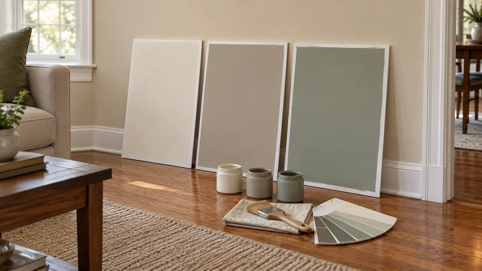
Short version, because we have written the long one already. Work from what is not changing — floors, counters, tile, brick, the sofa — and match undertones before you match colours. Narrow to two or three finalists, not eight. Paint each one at least two feet square in two coats, or on a white foam board you can move around, and live with it for two days across morning, afternoon and lamplight. Benjamin Moore's guidance on samples says to "brush out at least two coats to get the most accurate color depiction" and to "test your paint colors from morning to evening, under both natural and artificial lighting conditions," using "a white foam core board, so you can move the color around the room throughout the day." Benjamin Moore's interior page adds the first step most people skip: "consider the colors that are already in your room. The colors of your hardwood floors, countertops, fireplace, area rugs, and furniture will help determine which paint color families will work best."
Undertones, room orientation, artificial light and the 60-30-10 rule are the parts of this worth slowing down over, and they are what the in-home colour consultation that comes with every estimate is for. If you are choosing for a whole house rather than one room, do the public rooms first and let the hallway white follow them, not the other way round.
Paint Colors That Compliment Red Brick Interior
In New Jersey, the interior red brick question is almost always a fireplace: a floor-to-ceiling red brick chimney breast in a 1950s ranch, a 1960s split-level or a raised ranch family room. Benjamin Moore's own advice is to start there — the fireplace is on its list of existing colours that "help determine which paint color families will work best."
How we work it through on a consultation:
- Read the brick's undertone first. Hold a white board against it. Some New Jersey brick is orange-red, some is a cooler purple-red, and plenty of 1960s brick is a mixed buff-and-red blend. They want different walls.
- Warm, slightly pink-leaning neutrals are the safe answer. Pale Oak OC-20 (LRV 68.64) and Collingwood OC-28 (61.52), "a widely appealing warm gray with timeless versatility" in Benjamin Moore's words, both sit beside red brick without fighting it. Edgecomb Gray HC-173 works on warmer brick.
- Avoid a cool blue-gray. This is the pairing we are asked to repaint most. A cool gray wall makes orange brick look brighter and oranger, and both look worse.
- If you want contrast, go deep and green or blue-green. Evergreen Fog SW 9130 or Narragansett Green HC-157 beside red brick reads intentional in a way a mid-tone gray never does.
- Or stop painting around it. Painted or limewashed brick is a real option; see our guides to painting brick and limewashing brick before you decide.
The undertone-reading step is our own method, not a manufacturer instruction. The colour pairings above are what we have watched work on real fireplaces, which is a different kind of evidence from a published figure, and we would rather say so.
Historic and Victorian Interior Paint Colors
Both of our brands keep historic palettes. Benjamin Moore's Historical Collection is 191 colours — "sophisticated and understated, a family of favored colors that enhance any style home" — and includes Woodlawn Blue HC-147, Wickham Gray HC-171, New London Burgundy HC-61, Cushing Green HC-125, Hawthorne Yellow HC-4, Gloucester Sage HC-100 and Hale Navy HC-154. Sherwin-Williams' Historic Paint Colors collection — "as varied as American history itself, these diverse palettes are a patchwork of classical elegance and rustic simplicity" — is organised by era, with Victorian, Colonial Revival (1870s–1900s), Arts & Crafts, The Jazz Age, The Streamlined Years, Suburban Modern and The Classics palettes, and colours such as Polished Mahogany SW 2838, Downing Sand SW 2822 and Rookwood Dark Red SW 2801.
For Victorian interiors specifically, the National Park Service's Preservation Brief 28, "Painting Historic Interiors" (Sara B. Chase) is the honest reference, and it is more interesting than a colour collection. It notes that "Victorians tended to use high gloss clear (or tinted) finishes such as varnish or shellac on much of their wood trim and to use flat or oil paints on walls and ceilings" — so a Victorian room was a contrast of glossy wood and flat walls, not a contrast of colours. It records that "by 1850 and for the next 60 years thereafter, stencilled and freehand-painted decoration for walls and ceilings became a high as well as a humble art," and that graining and marbleizing were common, with baseboards, stair risers and fireplace surrounds often marbleized. It also points out that "high style houses from the mid-17th to late 19th centuries often had wallpaper rather than paint on the walls of the important rooms and hallways," which is why a strictly accurate Victorian parlour may not be a painted room at all.
Brief 28 is also clear about what a colour collection cannot do. Real historic colour comes from paint analysis: establishing the full sequence of layers, "termed a chromochronology," so that "when the correct layer has been identified, the color may be matched," and it warns that "any short-cut approaches to paint analysis that do not follow scientific procedures are generally not worth the expense." For most homeowners that is overkill, and the brief says so: "for a rehabilitation project, onsite analysis and color matching may provide an adequate palette," and "many paint companies make latex paints in colors that are close to historic colors as well as appropriate gloss levels, but contain no white lead and no hazardous volatile organic compounds." Its closing advice on colour is one we repeat constantly: "it is always a good idea to buy a quart and 'test paint' the color chosen for the job on site before making a total commitment."
Two New Jersey practicalities. Older interiors here very often have calcimine ceilings and oil-painted trim, and both change the prep; our guide to painting historic homes covers that, and anything built before 1978 brings the federal lead rules into it, which we explain in lead paint in older New Jersey homes. And if the room has original wood sash, the colour decision and the window reglazing decision are usually the same conversation, because the sash has to be sound before it is worth painting.
Timeless vs Trending Interior Paint Colors
The brands themselves draw this line. Sherwin-Williams puts its Top 50 forward as the colours that "stand the test of time," separately from its Color of the Year. Those are two different promises, and it is worth knowing which one you are buying. A Color of the Year is a forecast; a top-50 neutral is a safe bet.
Our own split, after twenty years of repainting our own work: timeless interior paint colors are warm whites, greiges in the 55–70 LRV band, muted sage and gray-green, and navy. Trending interior paint colors in 2026 are the warm midtone neutrals like Universal Khaki, the smoky jades, colour-drenched dark rooms and coloured interior doors. Both are fine choices — the difference is only how long before the room reads as a particular year. Look back at any trend list from a couple of years ago and most of what it named has already shifted, which is the argument for putting the fashionable colour somewhere cheap to change.
If you want the outside of the house to agree with the inside, our sibling guide to popular exterior house colors uses the same brands and the same method. And if the kitchen is the real project, cabinet colour follows different rules from wall colour — see kitchen cabinet paint colors and refinishing vs painting vs refacing.
New Jersey Houses: What Works Where
Colour advice written for a magazine assumes big windows and high ceilings. Most of what we paint does not have either. The patterns we see work on the housing stock in our service area:
- Center-hall colonials (the most common house in Monmouth and Middlesex counties) suit a single light neutral through the hall, living and dining rooms with one deep colour in the dining room. Because every room opens off the hall, one wall colour and one trim white does more for the house than six coordinated choices.
- Cape Cods have low ceilings, dormer walls and sloped ceilings. Painting walls and sloped ceiling the same light colour makes the room read taller; a strong wall colour under a white sloped ceiling makes it read lower.
- Split-levels and raised ranches usually have a dark lower-level family room with a brick fireplace and small windows. That is the room for a warm neutral at the high end of the LRV band, not a trendy midtone.
- 1950s–1970s ranches often still have original oak floors with a strong orange cast. Greige with a visible warm side — Accessible Beige, Edgecomb Gray, Shoji White — bridges that; a cool gray fights it.
- Shore houses from Monmouth County down through Ocean County take the pale blue-greens well, because the light coming off the water is already bright and slightly cool. Palladian Blue, Sea Salt and Beach Glass are the three we mix most near the shore.
- North Jersey older housing in Essex County and the towns around it is a different animal: taller ceilings, plaster walls, original oil-painted trim and real Victorian and Colonial Revival detailing, where the historic palettes above actually apply.
- North-facing back rooms, in any of the above, are where colours go wrong. Sample there first.
Sheen, Cost and Getting the Colour on the Wall
Sheen changes a colour as much as the colour code does: the same paint looks slightly deeper and softer in matte and slightly lighter and cooler in semi-gloss, because of reflection. Decide the finish before you judge a sample. Our satin vs eggshell guide has the actual gloss numbers from the manufacturers' data sheets and the room-by-room picks, so we will not duplicate it here.
Colour itself rarely changes the price of a job. What changes it is the switch: covering a dark colour with a light one, or a strong colour with a very different one, can take an extra coat, and deep colours and some whites need a tinted primer. Going from white trim to black trim means more cutting in and more coats on every door and window. For real numbers, see our interior painting cost guide, the detail in what it costs to paint a room in NJ, or the whole-house picture in how much it costs to paint a house in NJ. We do not publish a price for "a colour" because there is not one.
Brand matters less than product line, and both of ours can match the other's colours — and Behr's, Valspar's or Glidden's. Our Benjamin Moore vs Sherwin-Williams comparison explains where each line fits.
Get Help Choosing Your Interior Colors
Choosing a colour off a screen is the hardest way to do it, and standing in the room with boards is the easiest. NJ Painting Co. is a family-owned, licensed and fully insured painting company at 36 Church Rd, Morganville, NJ 07751, and we have painted New Jersey interiors for more than 20 years with Benjamin Moore and Sherwin-Williams products. Every estimate is free and includes an in-home colour consultation: we bring fan decks and sample boards, look at your floors, your brick and your light, and write the exact manufacturer, colour name, code, sheen and number of coats into the estimate so there is nothing to guess at later. Our work carries a two-year workmanship warranty.
See finished rooms in our gallery, read what our interior painting service includes, or call (732) 239-0932 and request a free estimate.
Frequently Asked Questions
What are the most popular interior paint colors in 2026?
Warm whites and off-whites — Benjamin Moore White Dove OC-17, Chantilly Lace OC-65, Simply White OC-117, Sherwin-Williams Alabaster SW 7008 and Pure White SW 7005 — followed by warm greiges such as Revere Pewter HC-172, Edgecomb Gray HC-173, Agreeable Gray SW 7029 and Accessible Beige SW 7036, and then muted greens like October Mist 1495 and Sea Salt SW 6204. Deep navy, charcoal and espresso brown are the accent colours, used on dining rooms, powder rooms, built-ins and interior doors.
What is the 2026 interior paint colour of the year?
There are five, one per brand. Sherwin-Williams chose Universal Khaki SW 6150, a warm midtone neutral at LRV 40. Benjamin Moore chose Silhouette AF-655, a deep espresso brown at LRV 10.18. Behr chose Hidden Gem N430-6A, a smoky jade. Valspar chose Warm Eucalyptus 8004-28F, a warm green sold at Lowe's. Glidden chose Warm Mahogany PPG1060-7, a grounded red-brown.
What are the 2027 Colors of the Year?
Sherwin-Williams chose Celery SW 6421, a pale herbal green at LRV 71. Benjamin Moore chose Webster Green HC-130, a deep green at LRV 20.2, announced 14 October 2026. Behr chose Grounded T27-01, an earthy olive. Valspar chose Cottage Door 8004-38E, a grayed blue with warm undertones. Glidden chose Artifact PPG10-16, a calm aqua. Three greens and two blues: the 2027 direction is muted green and soft blue, not gray.
What are the best interior paint colors that will not date?
Warm whites in the low to mid 80s LRV, greiges between about 55 and 70, muted sage and gray-green, and navy. Sherwin-Williams puts its Top 50 collection forward as colours chosen to "stand the test of time," which is a different promise from a Color of the Year. The colours that date fastest, in our experience, are the cool blue-grays of the 2010s and anything that is the only example of its temperature in the room.
What are the most popular neutral interior paint colors?
Benjamin Moore names Revere Pewter HC-172 as its iconic neutral; Sherwin-Williams' published top colours include Agreeable Gray SW 7029, Accessible Beige SW 7036, Drift of Mist SW 9166, Shoji White SW 7042, On the Rocks SW 7671 and Natural Linen SW 9109. On our own jobs the two most-bought neutrals are White Dove OC-17 and Edgecomb Gray HC-173.
What interior paint colors are now outdated?
No source publishes this, so this is our observation from repaints: cool blue-leaning gray walls, gray walls over gray-washed flooring, 1990s yellow-cast builder beige, sponged and ragged faux finishes, and burgundy or hunter green dining rooms. A well-maintained room in any of them still looks better than a badly painted trendy one, but warming the wall colour is the single change that most often makes a house feel current.
What paint colours compliment red brick interior?
Read the brick's undertone against a white board first — New Jersey brick runs from orange-red to a cooler purple-red. Warm, slightly pink-leaning neutrals are the safe answer: Pale Oak OC-20, Collingwood OC-28 or Edgecomb Gray HC-173. Avoid a cool blue-gray, which makes orange brick look brighter and oranger. For contrast, go deep green or blue-green rather than mid-tone gray.
What are good interior paint colors for a living room?
A warm white or a light greige, with the depth saved for one adjoining room. Sherwin-Williams' own living room picks include Silver Strand SW 7057, Pure White SW 7005, Amazing Gray SW 7044, Anonymous SW 7046 and Dover White SW 6385. In an open plan, use one light neutral across the whole connected space and change colour only at a real break such as an inside corner or a door casing.
What is LRV and what LRV should an interior colour have?
LRV, light reflectance value, is a 0 to 100 scale of how much light a colour reflects; it is on every manufacturer colour page. Sherwin-Williams recommends higher-LRV colours in north-facing rooms with little natural light. Indoors, anything above about 70 will read as an off-white, 50 to 70 is the usable wall-colour band for most New Jersey rooms, and below about 25 you are choosing a mood rather than a neutral.
What are historic or Victorian interior paint colors?
Both brands sell historic palettes: Benjamin Moore's Historical Collection is 191 colours, and Sherwin-Williams' Historic Paint Colors collection is organised by era including a Victorian palette. For genuine accuracy, the National Park Service's Preservation Brief 28 says colour has to come from paint analysis of the layers on your own walls, and warns that short-cut analysis is not worth the money. It also notes that Victorians typically used glossy clear or tinted finishes on wood trim with flat paint on walls and ceilings, and that important rooms in high-style houses often had wallpaper rather than paint.
Should interior doors be white or a colour?
Either works, and doors are the cheapest place in the house to use a strong colour. Sherwin-Williams calls a hallway full of doors "the perfect place to get creative with color." The colours we are asked for are Tricorn Black SW 6258, Iron Ore SW 7069 for a softer black, Hale Navy HC-154 and Urbane Bronze SW 7048. Painting only the inside face of each door keeps the hall white and gives each room the accent.
Can you match a Behr, Valspar or Glidden colour in Benjamin Moore or Sherwin-Williams?
Yes. Bring the chip to the estimate. We work in Benjamin Moore and Sherwin-Williams products and both can match a competitor's colour, so you do not have to change paint lines to keep a colour you have already fallen for. Our comparison of the two brands explains where each product line fits.
About the author
Written by the NJ Painting Co. team
NJ Painting Co. is a family-owned painting contractor based in Monmouth County, in business since 2004. We are licensed and fully insured, work with Benjamin Moore and Sherwin-Williams paints, and back our work with a 2-year workmanship warranty. We serve Monmouth, Middlesex, Ocean, Mercer, Somerset and Burlington counties, plus Union, Essex, Hudson, Bergen and Passaic in North Jersey.