The most popular kitchen cabinet paint colors are still whites and off-whites, with Benjamin Moore Chantilly Lace OC-65 and White Dove OC-17 at the front of the pack and Sherwin-Williams Alabaster SW 7008 and Pure White SW 7005 close behind. After that, the two families growing fastest on the kitchens we spray are warm neutrals, meaning greige, taupe and soft brown, and muted greens, from sage through to the near-black Vintage Vogue 462 and Pewter Green SW 6208. Navy is the dependable island color, black is the dependable base-cabinet color, and cool mid-gray is the one family we are now painting over more often than we are painting on. The 2026 Colors of the Year point the same way: a khaki from Sherwin-Williams, a deep brown from Benjamin Moore, a smoky jade from Behr and a grounded green from Valspar, and the 2027 picks lean further into green, led by Benjamin Moore's Webster Green HC-130 and Sherwin-Williams' Celery SW 6421.
We are a family-owned painting company in Morganville and have painted homes across Monmouth, Middlesex, Ocean, Mercer, Somerset and Burlington counties, plus Union, Essex, Hudson, Bergen and Passaic in North Jersey, for more than 20 years, using Benjamin Moore and Sherwin-Williams products. Cabinet painting and spraying is one of the things we do most, and every estimate includes an in-home color consultation, so a lot of our week is spent standing in kitchens holding sample doors against granite. This guide lists the colors we see chosen most, with each manufacturer's own code and light reflectance value (LRV) where the manufacturer publishes one, and then explains how to narrow them down for your kitchen. Codes, LRVs and the Colors of the Year below are as listed on benjaminmoore.com, sherwin-williams.com, valspar.com and Behr's corporate newsroom on 10 October 2026; the 2027 picks were checked on 20 October 2026. If you want prices, process or the paint-versus-refinish question instead, we have separate guides to cabinet painting cost in NJ, spray vs brush cabinet painting and refinishing vs painting vs refacing.
The Short Answer: The Best Cabinet Paint Colors Right Now
- Whites and off-whites remain the default. Benjamin Moore names Chantilly Lace OC-65 and White Dove OC-17 as two of its most popular kitchen cabinet colors; the off-whites its color team points to are Cloud White OC-130, Simply White OC-117 and Silver Satin OC-26.
- Warm neutrals are the growth area. Revere Pewter HC-172, Edgecomb Gray HC-173, Manchester Tan HC-81, Accessible Beige SW 7036 and Pashmina AF-100 are the greiges and taupes we sample most.
- Green is the current color. Pewter Green SW 6208, Evergreen Fog SW 9130, Vintage Vogue 462, Cushing Green HC-125 and the blue-green Aegean Teal 2136-40 cover most of what people ask for.
- Blue is the safe bold choice. Hale Navy HC-154, Van Deusen Blue HC-156, Newburyport Blue HC-155, Naval SW 6244 and Riverway SW 6222.
- Black and near-black own the lowers. Tricorn Black SW 6258, Benjamin Moore Black HC-190, Wrought Iron 2124-10, Iron Ore SW 7069 and Peppercorn SW 7674.
- Cool mid-gray is the one on the way out in our experience, and the brands' 2026 picks are all warm: Universal Khaki SW 6150, Silhouette AF-655, Behr Hidden Gem N430-6A and Valspar Warm Eucalyptus 8004-28F.
- Sheen is not a wall decision. Benjamin Moore says satin, semi-gloss and high-gloss finishes are the ones suited to kitchen cabinets.
- The color matters less than the coating. Wall paint in a beautiful color will still mark and stick on a door; a cabinet enamel in an ordinary white will not.
Kitchen Cabinet Paint Colors 2026: What the Brands Actually Picked
Each big paint brand names a Color of the Year in the preceding autumn. None of them is chosen specifically for cabinetry, so read them as direction rather than as instructions for your doors. For 2026, all four of the brands below moved warm at the same time, which is the clearest signal in years.
Sherwin-Williams 2026: Universal Khaki SW 6150
Sherwin-Williams' 2026 Color of the Year page introduces it this way: "Find strength in simplicity with Universal Khaki SW 6150, an essential neutral selected by our color experts for its beautiful balance of livability and longevity." Its color detail page lists an LRV of 40.478, which makes it a true midtone. On cabinets that reads as a warm stone-tan, and in our experience it is a genuinely good answer for a kitchen with tan travertine, honey-toned floors or busy warm granite that a cool gray fights with.
Benjamin Moore 2026: Silhouette AF-655
Benjamin Moore's Color of the Year 2026 page calls Silhouette "a distinctive color that weaves luxurious burnt umber with delicate notes of charcoal." Its color page gives an LRV of 10.18 and describes it as "reminiscent of tailored suiting." That is a deep espresso brown, and on a whole kitchen it would be a lot. Where we think it belongs is on base cabinets or an island under warm white uppers, which is exactly the kind of two-tone layout covered further down. The wider Color Trends 2026 palette on that page includes Swiss Coffee OC-45 and Narragansett Green HC-157, both of which are proven cabinet colors.
Behr 2026: Hidden Gem N430-6A
Behr's announcement of Hidden Gem N430-6A as its 2026 Color of the Year calls it "a smoky jade that uncovers exceptional beauty in every space" and "a dynamic blend of blue and green" that "creates environments that feel both grounded and energizing." That blue-green family is one of the most requested cabinet directions we see, and it is the same territory as Benjamin Moore's Aegean Teal.
Valspar 2026: Warm Eucalyptus 8004-28F
Valspar's 2026 Color of the Year press release names Warm Eucalyptus 8004-28F, "a grounded green that brings a sense of ease and timeless appeal to any space," and says its "warm undertones create a grounded, welcoming mood while drawing inspiration from nature and the familiarity of retro design." Its supporting colors are a light blue, Degas Blue 8004-35B, and a deep gray-brown.
What about 2027?
Every major brand has now named its 2027 color, and three of the five are green. Sherwin-Williams chose Celery SW 6421, described on its 2027 page as "an airy, herbal green that embodies fresh perspectives and elegance," with an LRV of 71.303. Benjamin Moore announced Webster Green HC-130 on 14 October 2026, calling it in its press release "a confident hue with undeniable personality" whose "depth and chroma allow it to work across traditional, contemporary and transitional design styles." Its color page gives an LRV of 20.2, which puts it in the same depth band as Retreat SW 6207 and Cushing Green HC-125: a lower-cabinet or island green, not an all-over one. Behr's 2027 pick is Grounded T27-01, "an earthy olive green" with "subtle brown undertones." Valspar went to blue with Cottage Door, "a grayed-out blue hue, enriched with warm and inviting undertones," per its 2027 page (8004-38E at Lowe's), and Glidden chose Artifact PPG10-16, "a calm, fresh aqua," on its 2027 page.
For cabinets, that is a clear signal. A pale herbal green such as Celery on uppers over a deeper green such as Webster Green or an olive below is the combination we expect to be asked for in 2027, and a grayed blue like Cottage Door is a softer island alternative to navy. Sample any of them on a real door first; deep greens shift a long way between morning and lamplight.
The Most Popular Cabinet Paint Colors, With Codes and LRVs
Nobody publishes a reliable ranking of cabinet colors for New Jersey, so this is a combination of what each manufacturer says is popular and what people choose at our estimates. Benjamin Moore's cabinet paint colors page names "the classic go-to white Chantilly Lace OC-65, the cool gray Seapearl OC-19, and the intriguing blue-green Aegean Teal 2136-40" as its most popular cabinet colors, and also lists Revere Pewter HC-172, Vintage Vogue 462, Hale Navy HC-154 and Black HC-190. Its kitchen cabinet paint colors page calls Chantilly Lace OC-65 and White Dove OC-17 "two of Benjamin Moore's most popular kitchen cabinet colors." Sherwin-Williams keeps a Top 50 interior colors collection where its director of color marketing, Sue Wadden, says: "These colors are consistent customer favorites for a reason. If you're looking for a hue to stand the test of time, pick from the top 50." Alabaster, Pure White, Agreeable Gray, Accessible Beige, Sea Salt, Shoji White and Tricorn Black are all in it.
Use the chart below the way we use a fan deck: find the lightness band you want first, then choose the undertone. LRV runs from 0 to 100 and tells you how much light a color reflects, so it is the single most useful number for predicting whether a cabinet color will read as light, mid or dark in a real kitchen.
| Color | Brand and code | LRV | Family | Where it works on cabinets |
|---|---|---|---|---|
| Chantilly Lace | Benjamin Moore OC-65 | 90 | Bright white | Crisp white kitchens with white quartz and white trim |
| Simply White | Benjamin Moore OC-117 | 90 | Bright white | A hair warmer than Chantilly Lace; safest bright white |
| Super White | Benjamin Moore OC-152 | 87 | Cool white | Modern slab and flat-panel doors |
| Cloud White | Benjamin Moore OC-130 | 85 | Soft white | Shaker doors next to warm counters |
| Greek Villa | Sherwin-Williams SW 7551 | 84 | Warm white | Warm white kitchens; pairs with brass |
| Pure White | Sherwin-Williams SW 7005 | 84 | Clean white | All-purpose white for doors and boxes |
| White Dove | Benjamin Moore OC-17 | 83 | Soft white | The most forgiving white we spray |
| Decorator's White | Benjamin Moore OC-149 | 83 | Cool white | Kitchens with cool gray or blue-veined stone |
| Snowbound | Sherwin-Williams SW 7004 | 83 | Soft white | Slightly pink-gray cast; good with marble look-alikes |
| Dover White | Sherwin-Williams SW 6385 | 83 | Cream white | Older kitchens with oak floors and warm tile |
| Alabaster | Sherwin-Williams SW 7008 | 82 | Warm white | The most requested SW cabinet white |
| Swiss Coffee | Benjamin Moore OC-45 | 82 | Warm white | Cream-leaning white; hides a yellow-ish wall |
| Creamy | Sherwin-Williams SW 7012 | 81 | Cream | Cream kitchen cabinet color with no yellow glare |
| Seapearl | Benjamin Moore OC-19 | 76 | Gray-white | Off-white with cool undertones; very popular on cabinets |
| Silver Satin | Benjamin Moore OC-26 | 75 | Gray-white | Soft, modern off-white |
| Shoji White | Sherwin-Williams SW 7042 | 74 | Greige-white | Warm off-white for a whole kitchen |
| Gray Owl | Benjamin Moore OC-52 | 65 | Light cool gray | Light gray cabinets that still read neutral |
| Edgecomb Gray | Benjamin Moore HC-173 | 63 | Light greige | The light greige we specify most on cabinets |
| Sea Salt | Sherwin-Williams SW 6204 | 63 | Soft green-gray | Bathroom vanities; soft coastal kitchens |
| Manchester Tan | Benjamin Moore HC-81 | 63 | Light beige | Warm neutral with oak floors and tan stone |
| Agreeable Gray | Sherwin-Williams SW 7029 | 60 | Light greige | Safe greige; reads warmer on cabinets than on walls |
| Repose Gray | Sherwin-Williams SW 7015 | 58 | Light cool gray | Light gray cabinets in a bright kitchen |
| Accessible Beige | Sherwin-Williams SW 7036 | 58 | Greige | Warm greige for a whole kitchen or an island |
| Guilford Green | Benjamin Moore HC-116 | 57 | Soft green | Light green cabinets without going minty |
| Revere Pewter | Benjamin Moore HC-172 | 55 | Greige | The classic bridge between warm and cool kitchens |
| October Mist | Benjamin Moore 1495 | 47 | Sage green | Mid sage on uppers or a full small kitchen |
| Pashmina | Benjamin Moore AF-100 | 44 | Mid greige | Islands and base cabinets under white uppers |
| Universal Khaki (SW 2026 COTY) | Sherwin-Williams SW 6150 | 40 | Warm midtone | Warm neutral cabinets with travertine or honey floors |
| Evergreen Fog | Sherwin-Williams SW 9130 | 30 | Gray-green | The gray-green we sample most for full kitchens |
| Dovetail | Sherwin-Williams SW 7018 | 26 | Mid-dark gray | Base cabinets; grays down a busy counter |
| Aegean Teal | Benjamin Moore 2136-40 | 25 | Blue-green | Islands and full kitchens; very current |
| Chelsea Gray | Benjamin Moore HC-168 | 23 | Warm dark gray | Base cabinets and islands with white uppers |
| Retreat | Sherwin-Williams SW 6207 | 21 | Mid-dark green | Lowers and islands; reads gray-green in low light |
| Cushing Green | Benjamin Moore HC-125 | 18 | Dark green | Full green kitchens with brass hardware |
| Fairview Taupe | Benjamin Moore HC-85 | 18 | Dark taupe | Brown cabinet color that is not a stain |
| Gauntlet Gray | Sherwin-Williams SW 7019 | 17 | Charcoal | Lowers in a modern kitchen |
| Riverway | Sherwin-Williams SW 6222 | 16 | Deep blue-gray | Islands; softer than a true navy |
| Kendall Charcoal | Benjamin Moore HC-166 | 15 | Charcoal | Base cabinets, mudroom and laundry cabinetry |
| Van Deusen Blue | Benjamin Moore HC-156 | 12 | Deep blue | Classic blue kitchen cabinet color |
| Pewter Green | Sherwin-Williams SW 6208 | 12 | Deep green | The green we are asked for most right now |
| Vintage Vogue | Benjamin Moore 462 | 12 | Smoky dark green | Used in place of black on lowers |
| Newburyport Blue | Benjamin Moore HC-155 | 10 | Dark blue | Islands and full navy kitchens |
| Silhouette (BM 2026 COTY) | Benjamin Moore AF-655 | 10 | Espresso brown | Base cabinets or an island under warm white |
| Peppercorn | Sherwin-Williams SW 7674 | 10 | Soft black-gray | A gentler alternative to true black |
| Char Brown | Benjamin Moore 2137-20 | 9 | Dark brown | Brown cabinets with a mossy undertone |
| Narragansett Green | Benjamin Moore HC-157 | 9 | Blackened teal | Islands; historic-feeling kitchens |
| Hale Navy | Benjamin Moore HC-154 | 8 | Navy | The default island navy |
| Wrought Iron | Benjamin Moore 2124-10 | 8 | Soft black | Black cabinets that are not harsh |
| Urbane Bronze | Sherwin-Williams SW 7048 | 8 | Bronze-brown | Warm dark neutral for lowers |
| Iron Ore | Sherwin-Williams SW 7069 | 6 | Soft black | Black lowers, pantry doors, laundry cabinets |
| Black | Benjamin Moore HC-190 | 5 | True black | Islands and base cabinets in high-contrast kitchens |
| Naval | Sherwin-Williams SW 6244 | 4 | Deep navy | Full navy kitchens and islands |
| Tricorn Black | Sherwin-Williams SW 6258 | 3 | True black | Maximum-contrast black cabinets |
Two things to know before you use that chart. First, cabinet doors are vertical, mostly in shadow, and surrounded by counter and backsplash, so almost every color reads darker on a door than it does on a chip or on a wall. Second, the "where it works" column is our own recommendation from years of spraying these colors, not something the manufacturers publish.
White kitchen cabinet paint colors, and why "just white" goes wrong
White is still the most-painted cabinet color in New Jersey by a wide margin, and it is also the one people get wrong most often, because "white" is thirty decisions, not one. Benjamin Moore's white kitchen cabinet colors page sorts the problem neatly: Chantilly Lace OC-65 and Super White OC-152 are "two of our brightest and cleanest white paint colors"; the cool off-whites Decorator's White OC-149 and White Heron OC-57 are for spaces you want to look warmer by contrast; and the warm off-whites White Dove OC-17 and Simply White OC-117 are for spaces where white "appears too gray or blue." The page adds the point we make at every consultation: "Lighting plays a key role in how paint colors cast. This is especially true for white paint colors."
Three failure modes we see over and over:
- A warm white next to white vinyl windows or white quartz. Swiss Coffee OC-45 looks lovely on its own and distinctly yellow against a bright white window casing. If your windows, trim and counters are staying bright white, a cabinet white in the high 80s reads cleaner.
- A bright white in a kitchen with warm oak floors and a tan backsplash. Chantilly Lace in that room looks cold and slightly blue, and it makes the floor look orange.
- White cabinets with white walls in the same white. With no separation, the cabinets disappear and the kitchen looks flat. We usually put a slightly deeper neutral on the walls, which is also the point at which the wall-color decision starts: our guide to interior paint colors in NJ covers that side of it, including the undertones that decide whether a wall neutral flatters your cabinet white or fights it.
Cream kitchen cabinet paint colors and warm neutrals
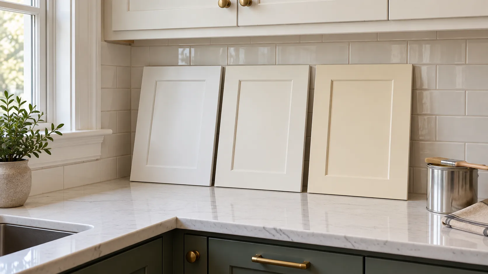
Cream came back quietly with the general move toward warmth, and it is the right answer more often than its reputation suggests. Creamy SW 7012 at an LRV of 81 and Dover White SW 6385 at 83 are the two we reach for most, with Swiss Coffee OC-45 as the Benjamin Moore equivalent. A true cream works when the kitchen already contains warm wood, terracotta tile, honey-toned floors or brass hardware, and it reads as dated when it is the only warm thing in a room full of cool stone.
If a full cream feels like too much commitment, the warm neutrals a step up in depth do most of the same work: Manchester Tan HC-81, which Benjamin Moore calls "a fresh, sophisticated beige that conjures stately sandstone façades," and Shoji White SW 7042 at 74.
Greige, taupe and brown cabinet paint colors
Greige is the family that fits the widest range of New Jersey kitchens, because so many of them have a fixed warm element we cannot change. Revere Pewter HC-172, which Benjamin Moore describes as "an iconic neutral that provides a versatile bridge between warm and cool tones," is still the one we specify most; Edgecomb Gray HC-173 is its lighter sibling at 63; Accessible Beige SW 7036 and Agreeable Gray SW 7029 are the Sherwin-Williams equivalents in the high 50s and 60.
Brown cabinet paint colors are a smaller but real request, usually from homeowners who want the look of wood without the limits of stain. Painting brown is a different project from staining brown, and it is worth being clear about which one you are asking for: you cannot stain painted cabinets without stripping back to bare wood, which is covered in our refinishing guide. For opaque brown, Fairview Taupe HC-85 at 18 is the mid-depth option, Char Brown 2137-20, "a lush brown with a hint of mossy undertone," is the deep one, and Urbane Bronze SW 7048 is the bronze-brown that behaves like a dark neutral.
Gray and grey cabinet paint colors: is gray over?
Not over, but narrowed. Cool, flat mid-gray cabinetry, the kind that was in every 2015 to 2020 kitchen, is the one family we now spray over more often than we spray on. What has survived is gray at the two ends: light grays with some warmth in them, such as Gray Owl OC-52 at 65 and Repose Gray SW 7015 at 58, and deep charcoals used on base cabinets and islands, such as Chelsea Gray HC-168, which Benjamin Moore calls "a handsome gray with the slightest hint of brown," Kendall Charcoal HC-166, Dovetail SW 7018 and Gauntlet Gray SW 7019.
If you like gray and want it to stay looking current, pick one with a visible undertone rather than a pure neutral, and keep the walls and counters out of the same lightness band so the kitchen does not go monochrome by accident.
Green cabinet paint colors: the one everyone is asking about
Green is the color story of the moment, and it is not a fad in the way that one specific shade can be, because green covers everything from a near-white sage to a blackened forest. Benjamin Moore's own kitchen pages point to Guilford Green HC-116, "a gentle green hue with pleasing warm undertones," at 57, and the sage October Mist 1495 at 47. In the mid-to-deep range, Evergreen Fog SW 9130 at 30 is the gray-green we sample most for a whole kitchen; Retreat SW 6207 at 21 goes a step deeper. The darkest and most dramatic end is Cushing Green HC-125 at 18, Pewter Green SW 6208 at 12, and Vintage Vogue 462, which Benjamin Moore describes as "an ultra-dark, smoky green that can be used in the place of black or brown."
The best green cabinet paint colors share one trait: a gray or warm undertone that keeps them from reading as mint or as lime. Greens with a strong yellow bias look dated fastest, and clean mint reads 1950s in a hurry. Green also behaves well with the hardware people are choosing now, because unlacquered brass and bronze sit naturally against it.
Blue kitchen cabinet paint colors
Blue is the long-running safe bold choice, especially on islands. Benjamin Moore's blue kitchen cabinets page calls blue "a bold yet timeless choice" and notes that "deep shades like navy or cobalt can create a sophisticated, elegant space, while lighter blues, such as powder blue or turquoise, bring an airy, beach-inspired feel." The colors it features include Aegean Teal 2136-40, Van Deusen Blue HC-156, Hale Navy HC-154, Symphony Blue 2060-10 and Newburg Green HC-158.
In practice we spray four blues more than any others. Hale Navy HC-154 at 8 is the default island navy and is as close to a no-regrets bold color as exists. Van Deusen Blue HC-156 at 12 is slightly softer and less black. Newburyport Blue HC-155 at 10 is Benjamin Moore's "perfect dark blue for the home." Naval SW 6244 at 4 is the deepest, close to ink. For something between blue and green, Aegean Teal 2136-40 at 25 is a former Benjamin Moore Color of the Year and a current favorite, and Riverway SW 6222 at 16 is the blue-gray that suits shore houses.
Black and very dark cabinets
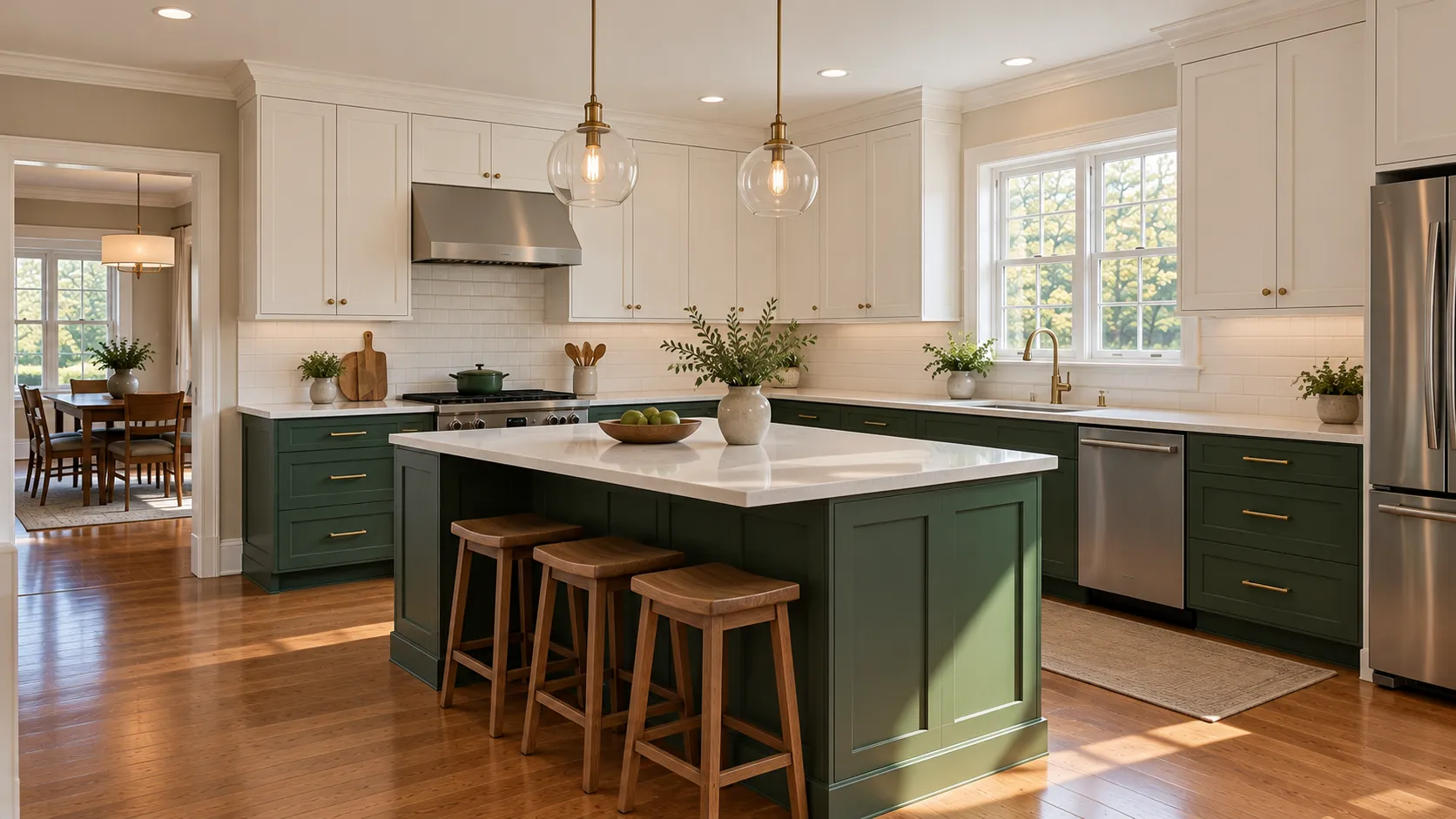
Black cabinetry is not a trend any more, it is a fixture, and it is almost always a partial decision: black lowers, a black island, a black pantry wall. Tricorn Black SW 6258 at 3 and Benjamin Moore Black HC-190 at 5 are the true blacks. In our experience a softened black is the better choice in most kitchens: Wrought Iron 2124-10 at 8, which Benjamin Moore calls "a shade of black beloved for its relatively soft, malleable character," Iron Ore SW 7069 at 6, or Peppercorn SW 7674 at 10, which reads as a very deep charcoal rather than a black.
Two practical notes. Very dark cabinets show dust, fingerprints and water spots far more than light ones, especially in satin. Benjamin Moore's cabinet page makes the opposite point about dirt, saying that "dark paint colors like forest green, charcoal gray, dark brown, and black are all apt to hide dirt better" — both are true, which is why we talk about where the color goes: dark hides cooking grime, light hides handprints. On the doors you touch every day, the handprints usually win the argument.
Timeless, Neutral and Modern Cabinet Paint Colors
"Timeless cabinet paint colors" and "modern kitchen cabinet paint colors" are usually two different questions wearing the same clothes.
The timeless and neutral end is narrow and well-proven: a soft white such as White Dove OC-17 or Alabaster SW 7008, a greige such as Revere Pewter HC-172 or Accessible Beige SW 7036, and a deep navy or charcoal on the island. That combination has looked right for thirty years and will look right in ten. Sue Wadden's point about the Sherwin-Williams Top 50 is the honest version of this: the colors that stand the test of time are the ones that have already been chosen most.
The modern end is about contrast and finish rather than about any particular hue. On flat-panel and slab doors we see the near-blacks, the deepest greens and the cool whites, often with a higher sheen and minimal or integrated hardware. The risk with modern is that a very specific color plus a very specific door profile ages as a pair. The hedge is to keep the architecture neutral and let the color carry the personality, rather than the other way around.
Two-Tone Kitchens: Uppers, Lowers and the Island
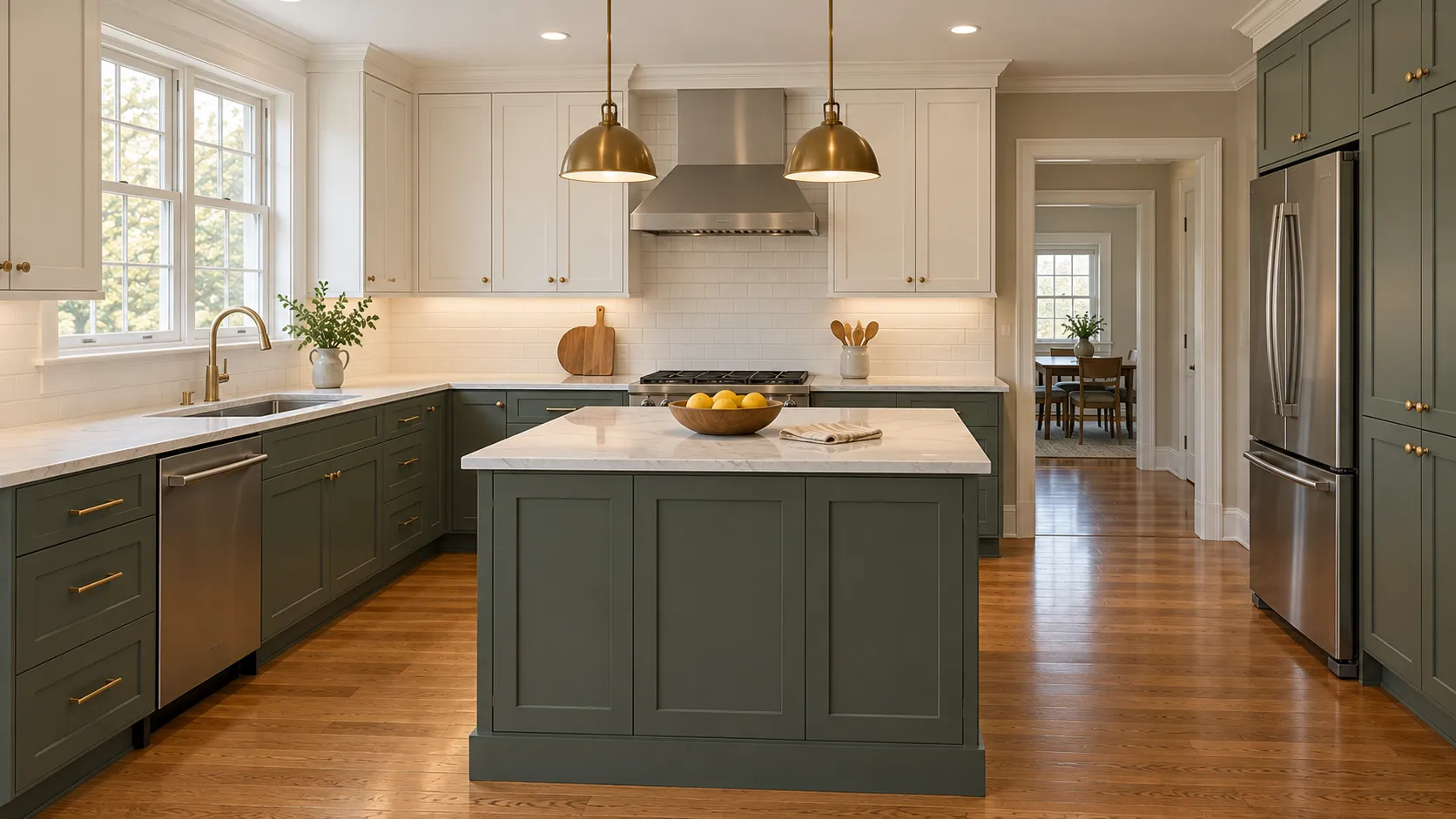
Two-tone is how most of the bolder cabinet colors actually get into a New Jersey kitchen, and it solves a real problem: a strong color on every door makes a standard-ceiling kitchen feel smaller, while the same color below the counter line anchors the room instead. Benjamin Moore's kitchen cabinet ideas page shows the pattern repeatedly, with "white-painted upper cabinets, dark blue lower cabinets and island" and the same arrangement in dark gray, and suggests pairings including Swiss Coffee OC-45 with Yarmouth Blue HC-150.
How we set it up:
- Keep the uppers light. An LRV in the 70s or above on the wall cabinets keeps the sightline bright.
- Put the depth below the counter. Base cabinets, the island and any tall pantry run can go as dark as you like, because you mostly see them at an angle and in shadow anyway.
- Leave a real gap in LRV. If the two colors are within about ten points, the kitchen looks like a mismatch rather than a decision. White uppers at 83 over an island at 8 reads as intentional.
- Use one island color, not two. An island painted a third color plus a fourth color on a hutch is where two-tone kitchens go wrong.
- Decide about the inside of the boxes. With glass doors or open shelving the interiors are part of the color scheme, and they are a separate line on the quote.
Practically, two-tone also costs more than one color, because the doors have to be separated, sprayed in two batches and kept apart while they cure. Our cabinet painting cost guide covers how that shows up in a quote, and the cabinet section of our cost guide has the ranges we work from.
Bathroom Cabinet Paint Colors Are a Separate Decision
A vanity is not a small kitchen. It is one or two doors and a couple of drawers in a small, usually poorly lit, usually humid room, and all three of those facts change the color answer.
Because a vanity is small, a saturated color is a much lower risk than it would be across a whole kitchen — Sherwin-Williams' own bathroom vanity guide uses a bright red, SW 6861 Radish, as its demonstration color. The colors we are actually asked for on vanities are softer: Sea Salt SW 6204 at 63, which is the green-gray that reads as spa-like; Evergreen Fog SW 9130; Hale Navy HC-154 and Van Deusen Blue HC-156; and the warm whites and creams for a powder room that needs to feel bigger.
Two bathroom-specific cautions. First, a windowless bathroom lit by one warm bulb will push any color warmer and darker than you expect, so sample it in the room with the door shut and the light on. Second, a vanity takes more standing water than any cabinet in the house, which is a sheen and product decision as much as a color one — the Sherwin-Williams vanity guide specifies Extreme Bond Primer after scuff sanding and then Emerald Urethane Trim Enamel, noting that "any surface prep short of clean, dry and dull will lead to poor adhesion." If you are painting the kitchen anyway, adding the vanities to the same visit is the cheapest color change in the house, because the setup is already paid for.
How LRV and Kitchen Light Change a Cabinet Color
Light reflectance value is the number printed on the back of the chip and listed on each manufacturer's color page. Sherwin-Williams' guide to color by room orientation defines it plainly — "The scale ranges from 0-100 with zero reflecting no light and 100 reflecting all light" — and says that to find it you "search the color number on the website and view the color's full details." The same page is the best free explanation of why the same color behaves differently in two kitchens: north-facing rooms get cool, low light and suit warm undertones and higher LRVs, south-facing rooms take almost anything, and east and west rooms shift from warm to cool across the day.
Kitchens add three complications that other rooms do not have. Cabinet doors are vertical, so they catch far less of the light coming through a window than a floor or a counter does. Upper cabinets live partly in their own shadow, and anything under them is lit by whatever is mounted beneath. And modern LED under-cabinet lighting has a color temperature of its own, which can make a warm white look greenish or a greige look purple at night. We ask clients to look at samples in the kitchen at three times: mid-morning, late afternoon, and after dark with the lights people actually use.
| Your kitchen | What usually goes wrong | What we recommend | Colors to sample |
|---|---|---|---|
| Small galley or condo kitchen | A mid or dark color on every door closes the room in | Keep everything above LRV 70; add color on walls or a single accent | Chantilly Lace OC-65, White Dove OC-17, Greek Villa SW 7551, Silver Satin OC-26 |
| North-facing, cool light all day | Cool whites and gray go blue and flat | Choose a warm undertone and a higher LRV | Alabaster SW 7008, Swiss Coffee OC-45, Manchester Tan HC-81, Shoji White SW 7042 |
| South or west-facing, strong afternoon sun | Warm whites and creams bleach out and look yellow | Go a step cooler or cleaner than the chip suggests | Decorator's White OC-149, Super White OC-152, Pure White SW 7005, Gray Owl OC-52 |
| 1980s or 1990s oak cabinets | The grain telegraphs through paint; a cool white fights the warm floor | Decide about grain filling first, then pick a soft or warm white | White Dove OC-17, Dover White SW 6385, Edgecomb Gray HC-173, Revere Pewter HC-172 |
| Dark granite or busy speckled counters | A mid-tone cabinet color competes and the room reads cluttered | Pull the lightest or warmest tone out of the stone and go lighter than it | Creamy SW 7012, Accessible Beige SW 7036, Pashmina AF-100, Manchester Tan HC-81 |
| White or light quartz, white window trim | A warm white cabinet looks dingy beside bright white surfaces | Match the brightness of the fixed white surfaces | Chantilly Lace OC-65, Simply White OC-117, Pure White SW 7005 |
| Big kitchen with an island | One color everywhere looks like a showroom | Light uppers, deeper base and island, at least 40 LRV points apart | White Dove OC-17 with Hale Navy HC-154, Pewter Green SW 6208 or Chelsea Gray HC-168 |
| Shore house used seasonally | Warm beige reads heavy in bright coastal light | Soft whites and blue-greens; keep the deep colors for the island | Seapearl OC-19, Sea Salt SW 6204, Riverway SW 6222, Aegean Teal 2136-40 |
| No windows, LED under-cabinet lighting only | The paint looks nothing like it did in the store | Judge every sample in the room under those lights at night | Any, but test twice as carefully |
Matching Counters, Backsplash, Floors and Hardware
Paint is the cheapest thing in a kitchen to change, so it should work around the things that are expensive to change. Benjamin Moore's kitchen cabinet page puts the core rule well: "When choosing paint colors for your kitchen cabinets, take note of your countertop's undertones. Selecting cabinet colors that share similar undertones will help create a cohesive and well-balanced look in your kitchen."
The order we work in at a consultation:
- Counters first. They are the largest fixed surface at eye level. Hold samples flat on the counter and upright against the edge.
- Then the backsplash. A tile with a strong glaze color sets the undertone for the whole room whether you like it or not.
- Then the floor. Orange-toned oak, red-toned tile and gray-toned LVP each rule out a different third of the fan deck.
- Then the fixed whites. Window casings, crown, baseboard and appliance panels that are staying white decide how bright your cabinet white has to be.
- Hardware last. Brass and bronze want warm and green; polished chrome and matte black are neutral and go with anything.
Benjamin Moore's cabinet page also offers the two legitimate strategies in a sentence each: either "select a contrasting color that stands out from the surrounding elements," or "extend the wall or trim color onto the cabinets" for a seamless look. Both work. What does not work is a cabinet color chosen to be a compromise between four things it does not match.
Outdated Kitchen Cabinet Paint Colors: What Looks Dated Now
This is our read of the kitchens we walk into every week, not a manufacturer position, and taste is personal — if you love one of these, that is a perfectly good reason to keep it. But if you are painting to sell, or want a color that will not need redoing in five years, these are the ones we steer people away from.
- Flat cool mid-gray. The 2015 to 2020 default. It is the single most common color we are now asked to paint over, and it dates a kitchen more precisely than almost anything else.
- Heavy antiquing glaze on raised-panel doors. A tinted glaze wiped into the profiles was everywhere in the 2000s, and nothing says "last remodel" faster. It has a legitimate use on genuinely ornate doors, which our guide to refinishing and antiquing cabinets explains, but on shaker doors it is a mistake.
- Yellow-leaning almond and builder beige. The warm neutral family is back, but not this part of it. Current creams are much grayer and more restrained than the almond of a 1990s kitchen.
- Bright primary accents. A single apple-red or sunflower-yellow island reads as a time stamp. A deep saturated color does not.
- Mint and sage-with-yellow greens. Green is the current direction, but the ones that look dated are the clean mints and the yellow-biased sages. The greens selling now are gray-based.
- Two colors from the same lightness band. Not a color so much as a mistake: greige uppers over beige lowers looks like something went wrong rather than like a two-tone kitchen.
- Black countertops plus black cabinets plus dark floors. Black is current; an all-dark kitchen with no light surface reads as an older, heavier look.
The direction the brands are pointing backs most of this up. Four brands independently chose warm colors for 2026 — khaki, espresso brown, smoky jade and a grounded green — and for 2027 Sherwin-Williams, Benjamin Moore and Behr all followed with greens, while Valspar and Glidden chose soft, grayed blues. Cool gray is not where anyone is heading. The same shift is visible outside, which we covered in our guide to popular exterior house colors.
Sheen for Cabinets, and Why It Is Not the Wall Answer
Sheen changes how a color looks as much as the color does: the glossier the finish, the deeper and richer a color reads and the more it shows every imperfection in the door. Cabinets also get handled and cleaned in a way walls never do, so the sheen rules are different. Benjamin Moore's kitchen cabinet guidance says "satin, semi-gloss, and high-gloss finishes are ideal for kitchen cabinets" because their luminous qualities highlight details, and its kitchen page recommends "eggshell, satin/pearl, or semi-gloss paint finishes" for a kitchen generally, "due to their durability and ability to resist moisture, grease, and stains."
What we specify: satin on most painted kitchens, because it is the best compromise between wiping clean and not spotlighting every dent in a thirty-year-old door; semi-gloss when a client wants the crisper, more factory-looking finish, or on a vanity that takes a lot of water; and high gloss only on genuinely flat, well-prepared modern doors, because gloss magnifies everything underneath it. We do not use flat or matte on cabinets. For the full explanation of sheen names and gloss levels, see our paint sheen guide.
Which Paints Those Colors Actually Go Into
A cabinet color is only as good as the enamel carrying it. Standard interior wall paint stays comparatively soft, so two painted surfaces pressed together — a door against a face frame, forty times a day — stick and tear. The products below are the ones made for the job, and each manufacturer's own data sheet is the source.
| Product | Type | Sheens | Color availability | From the data sheet |
|---|---|---|---|---|
| Benjamin Moore ADVANCE | Waterborne alkyd | Satin, semi-gloss, high gloss | White (01) and Black (80) plus Gennex tint bases 1X to 4X; some custom colors need a Deep Color Base Primer | "Ideal for interior doors, trim, cabinets, walls, and ceilings"; "block resistant"; up to 30 days "to reach optimum hardness and final sheen" |
| Sherwin-Williams Emerald Urethane Trim Enamel | Urethane-modified alkyd, waterbased | Satin, semi-gloss, gloss | Ultrawhite, High Hide White, Deep and Ultradeep bases; Black is "Do Not Tint" | "Excellent blocking and scratch resistance"; "Ideal for kitchens and other areas that are frequently cleaned"; dry to touch 1 hour, recoat 4 hours |
| Sherwin-Williams ProClassic Interior Waterbased Acrylic-Alkyd | Acrylic-alkyd hybrid | Satin, semi-gloss | Full Sherwin-Williams color range | "Excellent flow, leveling and sag resistance"; "non-yellowing compared to other conventional alkyds" |
| Valspar Cabinet, Door & Trim Oil Enriched Enamel | Oil-enriched enamel | Satin, semi-gloss | Valspar's color range | "This exceptional quality oil-enriched enamel provides a beautiful and smooth uniform finish"; "dries to a hard, durable finish" |
| Rust-Oleum Cabinet Transformations | DIY three-step bond coat and topcoat kit | Satin topcoat | "Available in 35 finish colors," tinted at the paint counter | Deglosser, bond coat, optional decorative glaze and clear topcoat; 12 hours before reinstalling drawers, 24 hours before full use, no cleaners for 7 days |
Benjamin Moore ADVANCE cabinet paint colors
ADVANCE is the Benjamin Moore product most cabinet work is sprayed in, and its technical data sheet describes it as "a premium quality, waterborne alkyd enamel that delivers the desired flow and leveling characteristics of conventional alkyd paint," listed as "ideal for interior doors, trim, cabinets, walls, and ceilings." Benjamin Moore's own kitchen page goes further, calling ADVANCE "the gold standard for painting or repainting kitchen cabinets."
There is no separate "ADVANCE color card," and this is the thing people searching for ADVANCE cabinet colors most want to know: the data sheet lists standard White (01) and Black (80) plus Gennex tint bases 1X, 2X, 3X and 4X, which means effectively the whole Benjamin Moore fan deck can be mixed in it. Every Benjamin Moore color in the chart above is available in ADVANCE. Two caveats come straight off the sheet. Certain custom colors "require a Deep Color Base Primer tinted to a special prescription formula to achieve the desired color," which matters if you are going for a near-black or a saturated green. And although ADVANCE "yellows less than conventional alkyds," the sheet warns "a slight amount of yellowing may occur," an effect "accelerated in dark or poorly ventilated areas and is more visible in lighter colors" — which is a real consideration for a bright white vanity in a windowless bathroom.
Sherwin-Williams cabinet paint colors
On the Sherwin-Williams side, every color in the chart can be mixed in Emerald Urethane Trim Enamel, whose data sheet lists Ultrawhite, High Hide White, Deep and Ultradeep bases and advises that "to optimize hide and color development, always use the recommended P-Shade primer." It also notes that "when repainting involves a drastic color change, a coat of primer will improve the hiding performance of the topcoat color," which is the technical reason that going from dark cherry to Chantilly Lace costs more than going from one white to another. Sherwin-Williams' Cabinet Refinishing: A Complete Guide ranks its three cabinet options: Emerald Urethane Trim Enamel is "the best choice for the most durable results," the acrylic-alkyd ProClassic "offers alkyd performance characteristics with acrylic properties," and the waterborne acrylic ProClassic is "a good choice for cabinetry in an area with low traffic." Our Benjamin Moore vs Sherwin-Williams comparison covers how the two brands line up more broadly, and either will match the other's colors.
Behr, Valspar, Rust-Oleum and Magnolia Home cabinet paint colors
Valspar sells a dedicated cabinet and trim enamel, which is the right category of product. Behr sells one too, but its product pages would not load for us when we checked on 10 October 2026, so we are not going to quote specifications we could not read; the Behr color we can source is its 2026 pick above. Valspar's Cabinet, Door & Trim Oil Enriched Enamel promises "exceptional flow and leveling" that "resists brush marks," and its cabinet color ideas page names its top cabinet colors, including Bistro White 7006-4, Antique White 7002-20, Granite Dust 5006-1C, Mallard 8003-35F, Northern Sky Blue 4008-5B and Noir 4009-2. Valspar's advice there matches ours on both counts: "Lighting plays a huge role in how you perceive color in a space," and on sheen, "Satin and semi-gloss sheens offer a good balance of the two, so they're what we recommend here."
Rust-Oleum Cabinet Transformations is a different animal: a DIY kit rather than a paint. Its technical data sheet describes "a three step coating system" of "an adhesive bond coat, decorative glaze (optional), and a protective clear top coat," "available in 35 finish colors" tinted at the paint counter. It uses a deglosser rather than sanding, and the sheet is specific that the kit contains enough bond coat for the frames, drawer fronts and both faces of the doors but "not enough to coat the insides of the cabinets or shelves." It is a reasonable weekend option on a small laminate kitchen; it is not what a sprayed finish looks like.
Magnolia Home by Joanna Gaines sells a trim and cabinetry line as well, which is where the searches for Joanna Gaines cabinet colors land. We do not stock it and cannot vouch for the product from a data sheet, so we will not make claims about it; if you bring us a Magnolia color you love, we will match it in a Benjamin Moore or Sherwin-Williams cabinet enamel and show you the drawdown before we spray anything.
Test the Color on a Real Door, Not a Chip
This is the step that prevents almost every cabinet color regret, and the step most people skip. Benjamin Moore's guidance on paint samples says to "brush out at least two coats to get the most accurate color depiction" and to test "from morning to evening, under both natural and artificial lighting conditions," and notes that sample pots are "for testing color only; they do not contain the performance enhancing components found in our regular paints."
How we do it on a cabinet job:
- Narrow it to three. More than three samples in the same family stop being distinguishable.
- Sample on a door, not a wall. We prime and spray a spare door or a piece of MDF cut to door size in the actual product and sheen. A sprayed satin sample looks nothing like two brushed coats of a sample pot.
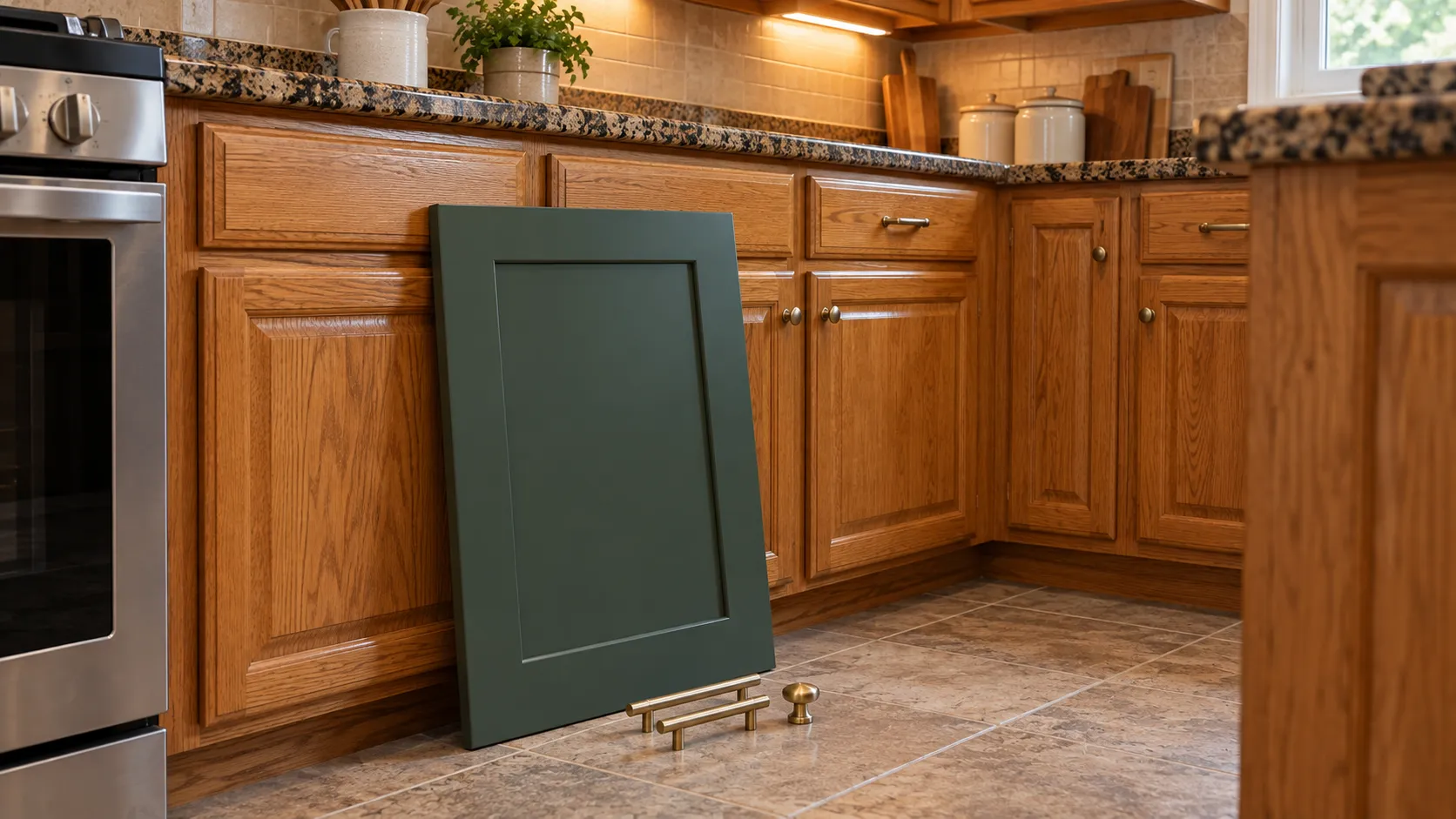
- Put it where the doors live. Stand it up against the cabinet run, next to the counter and the backsplash, with the hardware you plan to use laid on it.
- Look at it three times. Mid-morning daylight, late afternoon, and at night under the under-cabinet lights.
- Look at it from the doorway. A kitchen is seen from across the room, not from eighteen inches away.
- Check it against the walls. The cabinet color and the wall color are one decision, and the wall is usually the one that should move.
New Jersey Kitchens: Oak, Shore Humidity and Condo Rules
Three things come up often enough in our service area to be worth their own notes.
The 1960s to 1990s oak kitchen
A large share of the kitchens we paint in Monmouth, Middlesex and Ocean counties are honey or golden oak from the 1980s and 1990s. Red oak has deep open pores, and paint bridges them rather than filling them, so a sprayed white over unfilled oak reads as a lightly striated surface in window light. Some homeowners love that as character; others are disappointed the first sunny morning. Grain filling is a full extra cycle of work and is priced accordingly. The color angle is that this is also where white choice matters most: the warm oak floors that usually come with these kitchens make a cool bright white look blue, so a soft or warm white such as White Dove OC-17 or Dover White SW 6385 almost always sits better than Chantilly Lace. We show people an oak sample sprayed both ways, filled and unfilled, before anyone commits.
Shore houses and humidity
From Monmouth County down to Toms River and the barrier island towns, kitchens take humid summers and, in seasonal houses, months with the windows shut. Humidity does not change which color is right, but it changes the schedule: the ADVANCE data sheet says the paint "will dry slower than normal" above 50 percent relative humidity and should not be applied above 85 percent, and the full hardening window runs up to 30 days. Deep colors show handling marks before they are fully cured, so a navy island sprayed in July needs more patience than the same island in October. Light coastal daylight also tends to make warm beige read heavy, which is why we sample soft whites and blue-greens more often near the water. We cover the shore kitchens in detail on our Ocean County cabinet painting page.
Condos, townhouses and HOA kitchens
Interiors are almost never regulated by a homeowners association, so your cabinet color is your business. What associations do regulate is access, elevators, working hours and whether spraying is permitted inside the unit at all, which affects whether doors are finished on site or in our shop. In our experience the practical constraints in a Middlesex County condo are ventilation and the lack of a spare room to rack doors in, which is one reason we offer shop finishing. Condo kitchens are also usually small and often windowless, so this is exactly the situation where the LRV-70-and-up rule in the table above earns its keep.
Get Help Choosing Your Cabinet Colors
Picking a cabinet color is much easier with someone who has seen these exact colors sprayed on hundreds of New Jersey kitchens. NJ Painting Co. is a family-owned, licensed and fully insured painting company at 36 Church Rd, Morganville, NJ 07751, working on homes across Monmouth, Middlesex, Ocean, Mercer, Somerset and Burlington counties, plus Union, Essex, Hudson, Bergen and Passaic in North Jersey, for more than 20 years with Benjamin Moore and Sherwin-Williams products. Every estimate is free and includes an in-home color consultation: we bring samples, look at your counters, backsplash, floors and hardware, and write the exact manufacturer, color name, code, sheen and number of coats into the estimate. Our work carries a two-year workmanship warranty. See finished kitchens in our gallery, read how we work on our kitchen cabinet painting page, compare what a single room costs in our guide to the cost to paint a room in NJ, or call (732) 239-0932 and request a free estimate.
Frequently Asked Questions
What are the most popular kitchen cabinet paint colors?
Whites and off-whites, led by Benjamin Moore Chantilly Lace OC-65 and White Dove OC-17, which Benjamin Moore itself names as two of its most popular kitchen cabinet colors, and Sherwin-Williams Alabaster SW 7008 and Pure White SW 7005. After white, the most-chosen families are warm neutrals such as Revere Pewter HC-172 and Accessible Beige SW 7036, muted greens such as Pewter Green SW 6208 and Evergreen Fog SW 9130, navy such as Hale Navy HC-154, and black such as Tricorn Black SW 6258.
What are the kitchen cabinet paint colors for 2026?
The 2026 Colors of the Year all point warm: Universal Khaki SW 6150 from Sherwin-Williams, Silhouette AF-655 from Benjamin Moore, Hidden Gem N430-6A from Behr and Warm Eucalyptus 8004-28F from Valspar. On cabinets that translates into warm whites and creams, greige and taupe, muted greens and blue-greens, with cool mid-gray falling out of favor.
What are the 2027 Colors of the Year for cabinets?
Sherwin-Williams chose Celery SW 6421, a pale herbal green at LRV 71; Benjamin Moore chose Webster Green HC-130, a deep green at LRV 20.2; Behr chose Grounded T27-01, an earthy olive; Valspar chose Cottage Door 8004-38E, a grayed blue; and Glidden chose Artifact PPG10-16, a calm aqua. On cabinets, the deep greens suit lowers and islands, Celery suits uppers or a whole light kitchen, and the grayed blues are a softer alternative to navy on an island.
What are the best Sherwin-Williams cabinet paint colors?
The ones we spray most are Alabaster SW 7008, Pure White SW 7005, Snowbound SW 7004, Dover White SW 6385 and Greek Villa SW 7551 for whites; Agreeable Gray SW 7029, Accessible Beige SW 7036 and Shoji White SW 7042 for neutrals; Evergreen Fog SW 9130, Retreat SW 6207 and Pewter Green SW 6208 for greens; Naval SW 6244 and Riverway SW 6222 for blues; and Tricorn Black SW 6258, Iron Ore SW 7069 and Peppercorn SW 7674 for black. Alabaster, Pure White, Agreeable Gray, Accessible Beige, Sea Salt and Tricorn Black all appear in Sherwin-Williams' own Top 50 interior colors collection.
What are the most popular Benjamin Moore cabinet paint colors?
Benjamin Moore's cabinet paint colors page names Chantilly Lace OC-65, Seapearl OC-19 and Aegean Teal 2136-40 as its most popular cabinet colors, along with White OC-151, Revere Pewter HC-172, Vintage Vogue 462, Hale Navy HC-154 and Black HC-190. Its white cabinet page adds Cloud White OC-130, Simply White OC-117, Silver Satin OC-26, Decorator's White OC-149 and White Heron OC-57.
What colors does Benjamin Moore ADVANCE come in for cabinets?
Effectively the whole Benjamin Moore fan deck. The ADVANCE data sheet lists standard White (01) and Black (80) plus Gennex tint bases 1X through 4X, so any Benjamin Moore color can be mixed in it. The sheet notes that certain custom colors need a Deep Color Base Primer tinted to a special prescription formula, which applies to some deep greens, navies and near-blacks, and that a slight amount of yellowing may occur, most visibly in lighter colors in dark or poorly ventilated rooms.
What are the best green cabinet paint colors?
Choose by depth. For a light sage, Guilford Green HC-116 at an LRV of 57 or October Mist 1495 at 47. For a mid gray-green, Evergreen Fog SW 9130 at 30 or Retreat SW 6207 at 21. For a deep green, Webster Green HC-130 (Benjamin Moore's 2027 Color of the Year) at 20, Cushing Green HC-125 at 18, Pewter Green SW 6208 at 12 or Vintage Vogue 462 at 12, which Benjamin Moore describes as a smoky green that can replace black or brown. The greens that hold up have a gray or warm undertone; clean mints and yellow-biased sages date fastest.
What are good blue kitchen cabinet paint colors?
Hale Navy HC-154 at an LRV of 8 is the default island navy. Van Deusen Blue HC-156 at 12 is slightly softer, Newburyport Blue HC-155 at 10 is Benjamin Moore's "perfect dark blue for the home," and Naval SW 6244 at 4 is the deepest. For blue-green, Aegean Teal 2136-40 at 25; for a blue-gray that suits shore houses, Riverway SW 6222 at 16.
What are the best bathroom cabinet paint colors?
A vanity is small enough that a saturated color is low risk, so the useful question is what suits a small, humid, often windowless room. The colors we are asked for most are Sea Salt SW 6204, Evergreen Fog SW 9130, Hale Navy HC-154 and Van Deusen Blue HC-156, plus warm whites and creams in a powder room that needs to feel larger. Sample it in the room with the door shut and the light on, because one warm bulb pushes every color warmer and darker than you expect.
Which kitchen cabinet paint colors look outdated now?
In our experience: flat cool mid-gray, which is the color we are most often asked to paint over; heavy antiquing glaze on raised-panel doors; yellow-leaning almond and 1990s builder beige; bright primary accent islands; clean mint and yellow-biased sage greens; and any two-tone scheme where the two colors are within about ten LRV points of each other. Taste is personal and none of this is a rule, but the direction every major brand picked for 2026 is warm, and cool gray is not part of it.
What sheen should kitchen cabinets be painted in?
Satin for most painted kitchens, semi-gloss for a crisper factory look or a vanity that takes a lot of water, and high gloss only on flat, well-prepared modern doors. Benjamin Moore says satin, semi-gloss and high-gloss finishes are the ones suited to kitchen cabinets, and Valspar recommends satin and semi-gloss for the same reason. Flat and matte are not cabinet sheens; they mark and will not wipe clean.
Is a timeless neutral cabinet color a safer choice than a bold one?
For resale, usually. No source can promise a color raises a sale price, and we will not claim one does, but a soft white or greige with a deeper island reads as finished to the widest range of buyers. If you are staying in the house, the compromise that works is light uppers in a neutral with the bold color on the base cabinets and island, because that is the half of the kitchen that is cheapest and quickest to change later.
About the author
Written by the NJ Painting Co. team
NJ Painting Co. is a family-owned painting contractor based in Monmouth County, in business since 2004. We are licensed and fully insured, work with Benjamin Moore and Sherwin-Williams paints, and back our work with a 2-year workmanship warranty. We serve Monmouth, Middlesex, Ocean, Mercer, Somerset and Burlington counties, plus Union, Essex, Hudson, Bergen and Passaic in North Jersey.